It is very common to find tutorials about making page curls. Many of those tutorials are great, but the final effect is very unrealistic, not because of the quality of the tutorial, but due to the 3d nature of the effect.
Creases and folds are more subtle, instead. They can be created only with clever shading and little or no retouching at all. At first glance they may look intimidating, but as soon as you realize how to create basic creases, you will be able to move on to more complex projects.
Downloading the base image with a paper texture
For this tutorial, I will choose one paper background from my collection of High Resolution Paper Backgrounds. At that page, you will be able to download a free high resolution version of the texture used for this tutorial.
Download the base psd file to start working side by side with this tutorial.
As you can see, this paper texture lies flat on the background. And it will remain like that. We will create the illusion of relief using proper shading techniques. No transformation will be applied to the texture or shape of the page.
Simulating the paper folds
The paper we will create will have two folds marks (creases). To simulate these creases, we are going to create a special gradient with the gradient tool. Go to EDIT > PRESETS MANAGER. From the pulldown menu select GRADIENTS. At this point, you can choose to click the LOAD button and load the pre-made created gradient. You can download this gradient here:
Or just click on any gradient swatch and create the gradient yourself. The image below shows how to create this gradient. Even if you decide to load the gradient, take a look at the instructions to create the gradient to understand the theory behind this effect. This will let you create different gradients for different fold effects.
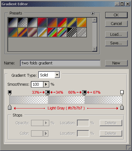
In this example I chose a light gray color. It can be black or any other gray value, but since the effect has to be subtle, it is better to start with a light gray and then adjust the transparency. As you can see, the chosen gray is applied on both the beginning and end of the gradient.
Now, we will add opacity (transparency) to the gradient. The opacity swatches will be of 100% (black swatch) and 0% (white swatch) and they will be applied in each third of the gradient length. This way, the folds will be distributed evenly.
Take a look at each third of the gradient and you will see that there is a small gap of 1% between each stop. This gap will create a tiny smooth transition that will add more realism to the effect.
Simulating the paper folds with the gradient tool
Step 1Create a new layer on top of the PAPER TEXTURE layer and name it FOLDS. |
|
Step 2Select the FOLDS layer and go to the menubar and select: LAYER > CREATE CLIPPING MASK (Alt+Ctrl+G in Windows). |
|
Step 3Select the GRADIENT TOOL from the tools palette and select the folds gradient we’ve just previously created. |
|
Step 4Now that you’ve just applied the gradient to the FOLDS layer, go to the LAYERS palette and with the FOLDS layer still selected, choose MULTIPLY as the layer blending, and set opacity to 50%. The MULTIPLY blending mode will mix the grays with the texture, and the 50% opacity value will make the shadows very subtle. I selected these values because they look good, but it is a good idea to experiment with other blending modes and opacities to create different illumination effects. |
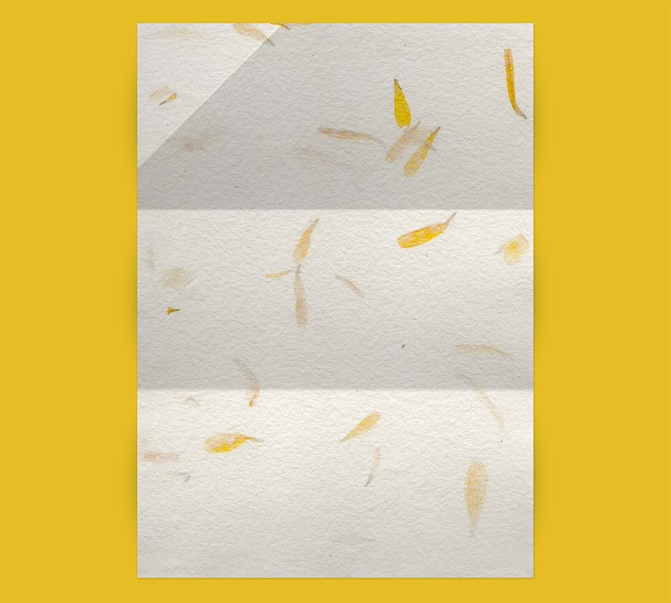
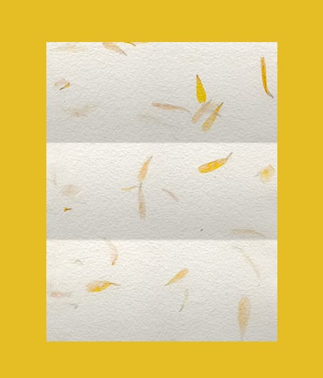
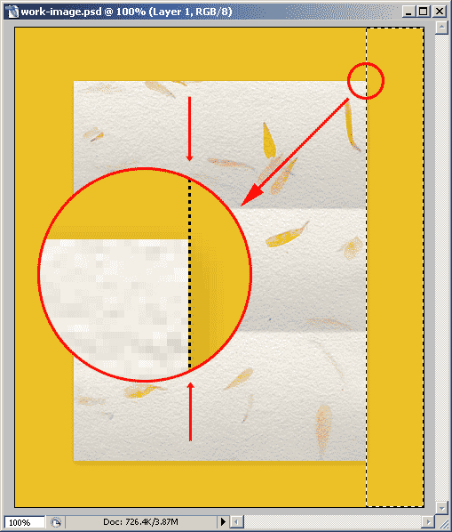
The image below shows how we are doing so far. The selected gradient type, blending mode and opacity gives the texture an appearance of a paper that has been folded twice. Take a look at the creases. Earlier in this article I mentioned a 1% gap between the transparency swatches in the gradient. The image shows clearly that this gap helps to add realism to the texture. In this case, the texture has a subtle roughness that helps even more.
Adding shadows to the paper texture
The image still looks flat and we don’t want that. We can go into endless retouching hours trying to give some curved perspective to the sides of the paper texture, but eventually it will look unrealistic. All we have to do is to add an extremely subtle drop shadow and a couple of brush strokes.
There is something that we should be aware. This kind of 2D representation, has a 3D appearance due to the clever shading applied. But it is by no means a real shading. This shading is done in a way to trick our brain. And our brain responds with a 3D comprehension of that image.
So, in the next step I will show you how to add shadows to give more relief to the paper texture.
Step 1Select the PAPER TEXTURE layer. Go to the Layer Styles menu and select DROP SHADOW layer style. Check the image on the right to see the setting we will be using in this example. It is important to note that it is better to uncheck the USE GLOBAL LIGHT setting to keep this drop shadow independent from other shadows that you may apply later. These settings are applied according to the scale of the image we are working on now. For greater resolutions you will have to increase these values. Notice that the SIZE of the shadow (7px) is greater than the DISTANCE (2px). The shadow will appear with more strength on the right and bottom sides, but still showing a little shadow on the top and left sides of the paper texture to cut it out from the background. Set the OPACITY to a very low value and SPREAD to 0. This will make the shadow really subtle. |
|
Step 2Select the BRUSH TOOL. Set a brush tip of DIAMETER: 300px and HARDNESS: 80%. This settings should be changed according to the size of the image. In this case we need a slightly curved shadow so that’s why we have to use a brush tip diameter so large. The hardness was set according to the size of the brush tip. |
|
Step 3Create a new layer below the PAPER TEXTURE layer and name it SHADOWS. Select this layer and proceed with the rest of the tutorial. |
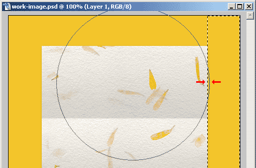
Now make a selection that masks one side of the image. The selection should be adjacent and should not superimpose the paper texture. The image below shows how the selection should be done. If you are an advanced Photoshop user, you can mask that area the way you like. This is just one way of doing it (and easier to explain than using layer masks).
With the brush tool selected, make just one click on the masked area just like the image below shows:
After that, repeat the same procedure on each third (folds) of the paper texture. Then, select the left side and, again, repeat the brush clicks on each fold. When finished, adjust the SHADOWS layer OPACITY to 30% or so.
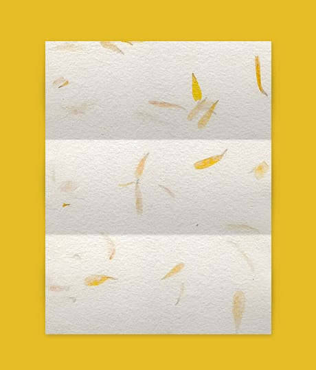
The final result should be something like the following image:
Notice the little perturbations in the drop shadow of the paper texture. This is not a real shadow projection. It is just a visual illusion just to trick the eye.
Adding a crease to the paper texture
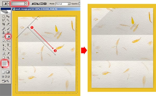
Create a new layer and name it CREASE. Select the CREASE layer and with the POLYGONAL LASSO tool, make a selection like the one you can see on the image below. Go to SELECT > FEATHER and set it to 0.5.
Choose #B7B7B7 as FOREGROUND COLOR, and with the gradient tool paint a gradient like the image below shows. Set the CREASE layer OPACITY to something like 40%. Don’t deselect your selection. If you accidentally deselected it, then go to the menubar and choose: SELECT > RESELECT and the selection will reappear. Look at the image on the right to see how the gradient looks on the paper texture.
With the CREASE layer still selected, select the MARQUEE tool. Now go to the menubar and choose: SELECT > INVERSE to invert the selection.
With the keyboard arrows, nudge the selection 2 pixels up and 2 pixels left and apply the same gradient you’ve just have used in the previous step. Check the image below to see how things are done.
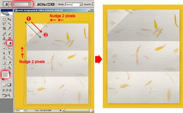
We applied a 2 pixel nudge in both up and left directions just to create an almost invisible gap between the two gradients. This gap gives the illusion of a crease. Creases are not blade sharp. The thickness of the paper usually gives the crease a little relief.
And that’s all. The following image should match the paper texture you created with this tutorial.
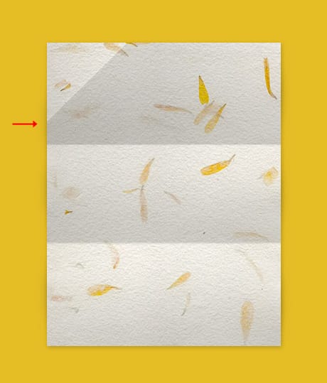
This new crease we added should project a different shadow on the left side of the paper texture. Since we’ve previously created the shadows, then you should correct this by selecting that portion of the shadow and nudging it some pixels down, until it looks like the image above.
So, as you can see, it all went into creating shadows and shades to give the illusion of a folded paper. Using these techniques you can create many other kinds of paper folds. Just use your imagination and your Photoshop expertise.