Give Your Photos a Color Ink Sketch Effect

No matter how good the photos we take are, we always feel the urgent need to turn them into a drawing effect. The standard installation of Adobe Photoshop gives you a wide range of artistic plugins that have very specific names, but fail to deliver when used with the default settings.

That’s the case of the Graphic Pen plugin. The resulting image is far from acceptable. Perhaps it looked good, many years ago, when it was part of the revolutionary Artistic Effects collection published by the now defunct, Aldus Software. But now, with the vast amount of artistic effects plugins and applications (such as Gertrudis Pro, the best one in my opinion), you should have to find a way to make the most of those plugins.

In this tutorial you will learn how to use the Photocopy and Sharpen More filters, and the Overlay blending mode to archieve colored ink drawings.

Creating the ink sketch effect

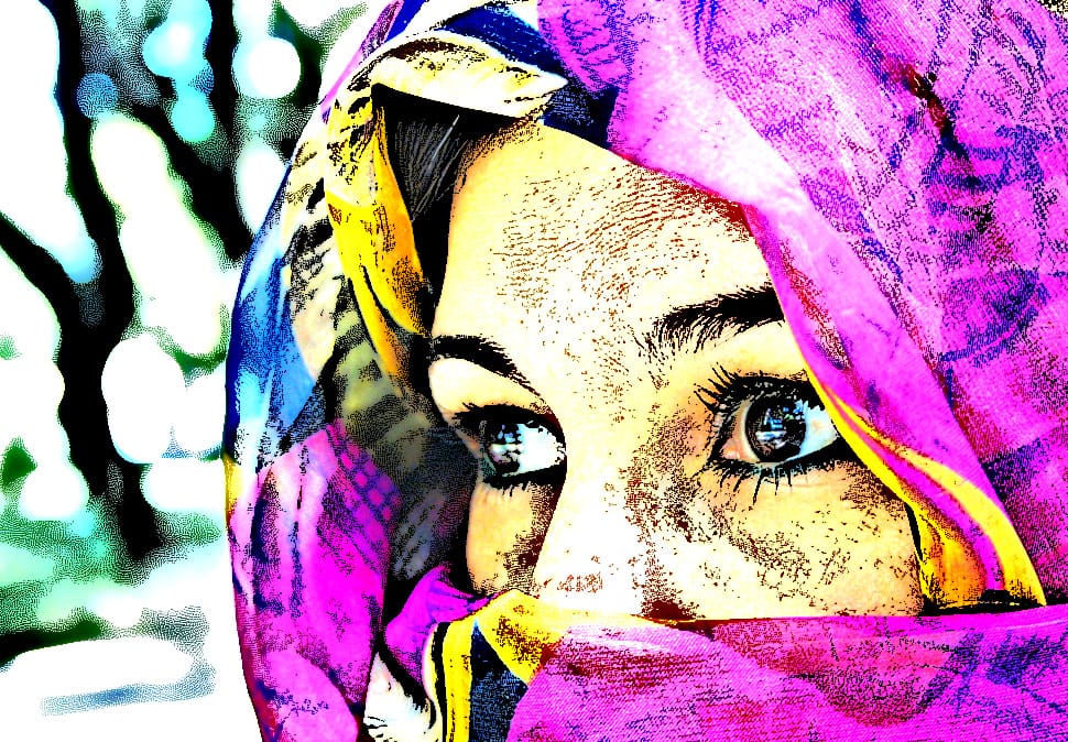
For this tutorial we will use images from MorgueFile, an incredible repository of free images. Download and open this image named One Look by Luis C. Tejo from Argentina.

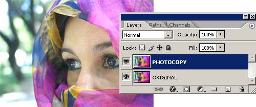
Step 1: Make a copy of the image in a different layer and select that layer.

Step 2: Apply the Photocopy filter (FILTERS >> SKETCH >> PHOTOCOPY) to the topmost layer using the settings shown in the image above. Click on the image to se a larger version of the result.

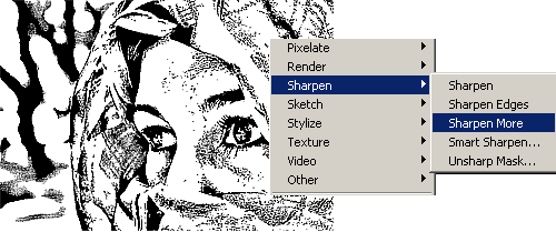
Step 3: Apply the Sharpen More filter (FILTERS >> SHARPEN >> SHARPEN MORE ) three times. Click on the image to se a larger version of the result.

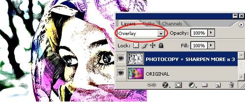
Step 4: Select Overlay as the blending mode of the layer. This will make the underlying colors visible. Click on the image to se a larger version of the result.

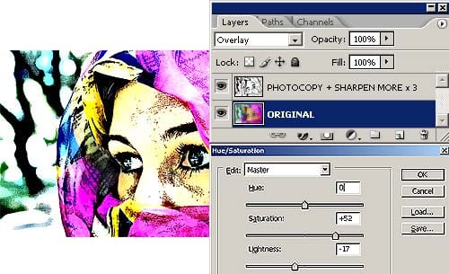
Step 5: Select the Original layer and modify the colors using the Hue/Saturation command (IMAGE >> ADJUSTMENTS >> HUE/SATURATION).

The final image will look like this one:

A little explanation and other examples

The secret of this technique relies in the Photocopy filter. The settings used in the example outlined previously, shouldn’t be used as is. You should try different Photocopy filter settings for each image, even for the same image when used at different resolutions. The same goes to the Sharpen More filter. If the Photocopy filter results are light and thin, then applying the Sharpen More filter once or twice will be enough. But if the results are dark and thick, then you should apply the Sharpen More filter three or more times. You will have to play with those settings for a while with each image.

The Overlay blending mode was chosen because the Multiply blending mode reveals all the imperfections and textures of the image below through the white areas of the sketched face.

The Overlay blending mode, instead, is like applying a Lighten and Darken blending modes at the same time. This results in a mixture of contrast and saturation increase.

In the end it doesn’t matter why, the point is that it looks good in this case.
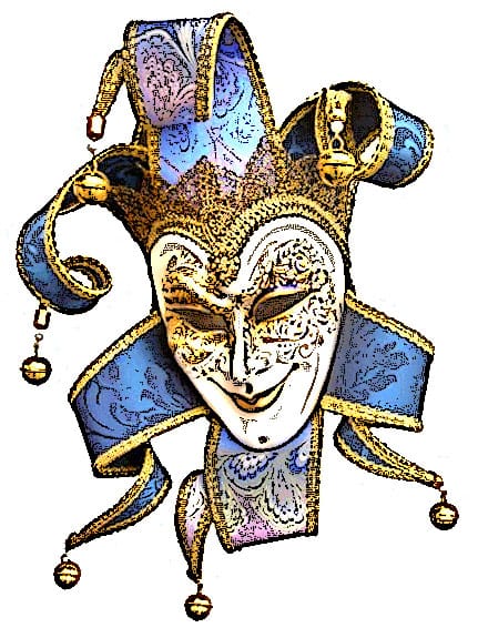
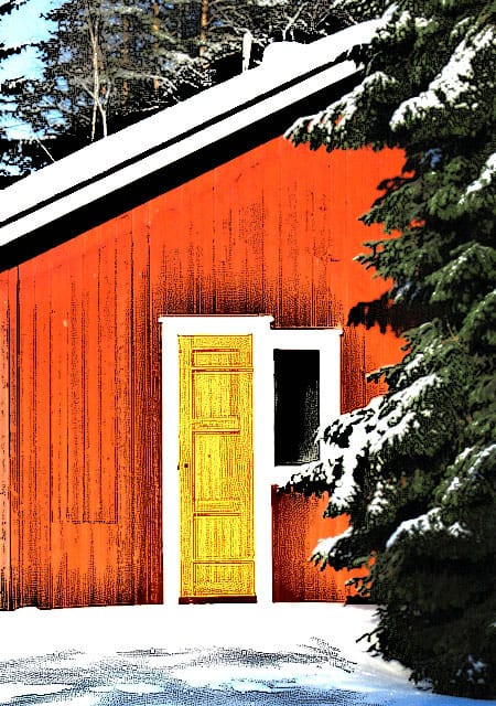
Other examples

Cottage by Harri from Finland. Click to enlarge

Hot air balloon © Nicolas Raymondi from Canada . Click to enlarge

Mask by Dorne from Dominican Republic. Click to enlarge

 16 comments

  1. Would also make a superior watercolor filter. Nice idea!

  2. this is beautiful…thanks for sharing!

  3. you can get almost the same result with threshold, overlay, hue/sat.

  4. Great tutorail , love it…

  5. Wow,this tutorial is great,its easy and real good to use,thanks for sharing really!!

  6. This is an excellent tutorial! Leaps and bounds over the sketch effect tutorials you see on every learning website.

  7. I cant get the result after following the instructions step by step, when i apply the photocopy filter with the same pic and setting given, its dark (not as shown in the example) Did any1 have the same problem?

  8. Me gustaría tener la posibilidad de ver esta misma información en Español, De todas formas agradezco a la persona que la ha compartido con todos su generosidad. GRACIAS!!!
    Saludos a todos

  9. duplicate layer
    duplicate layer
    press ctrl-i to invert
    select color dodge for top layer
    apply gaussian blur (generally around 7) or until you like what you see

    about the same thing, just lighter lines

  10. Thanks for sharing your tip Garth.

    I’ve tried it and it is very nice.

    But it lacks the black ink outlines to be considered an alternative for the technique outlined with this tutorial.

    It will be great if you can leave a link here to some examples you obtained with your technique.

  11. great.. nice tutorial…

  12. Absolutely perfect for my needs! I know I will use this simple and effective technique many times. Thank you so much!

  13. […] Color ink illustration […]

  14. […] […]

  15. Dude this is so cool easy and fun i do this all the time when ever i can and it looks amazing when im done everyone should try this!!!! ;)

  16. Love it!!!!!!!
    from a 8 year old

 Leave a comment about this article

Search this site

Photoshop Roadmap Sections

New Digital Cameras

ads from Shopzilla

Photoshop and Design Books

Adobe Photoshop CS3 Classroom in a Book
This thorough, self-paced guide to Adobe Photoshop CS3--written by the experts at Adobe Systems' is ideal for beginning users who want to learn key Photoshop concepts and techniques...

Dot Dot Dash: Designer Toys, Action Figures And Character Art
Dot Dot Dash! is brought to you by the editors of Pictoplasma and Pictoplasma 2. Expanding on the widely popular subject of contemporary character design, this definitive volume showcases an up-to-date survey of the personalities and characters that have entered the third dimension...

Crumble, Crackle, Burn: 60 Stunning Textures for Design and Illustration
Crumble Crackle Burn is not only an inspiring book for incorporating texture into design, but also an affordable tool for transforming your images with textures--you'll receive 120 royalty-free textures you can use immediately!

Photoshop and Design Software

ads from Shopzilla