Chrome effects are notoriously challenging to create because chrome itself has no inherent color; it's all about reflections. Glossy plastics are somewhat easier to simulate, but they present their own set of challenges. In this tutorial, we'll explore some advanced Photoshop Layer Styles techniques to create stunning chrome and plastic text effects.
For this demonstration, I've used the Helvetica Rounded Bold font. However, you can use any rounded font you prefer, such as the free Simply Rounded font. While this effect tends to look best with rounded fonts, experimenting with other typefaces can yield interesting and unexpected results as well.
Reflective Chrome Effect
For the sake of simplicity, this tutorial will use only a couple of letters to illustrate the process. You can later recreate this effect using a longer word or a logotype, whatever you decide.
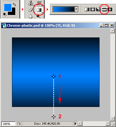
Start with a 290×230 work area. Paint a blue (#0080FF) and black gradient as shown in the image below to emphasize the techy look of the effect:
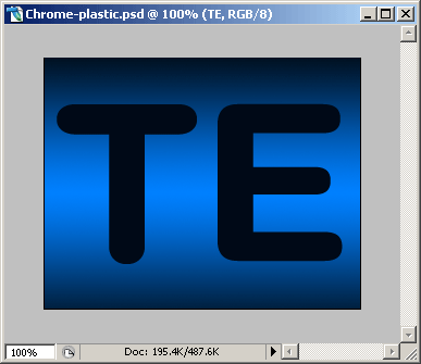
Now type two letters with a size of size 200px (“TE” in this example).
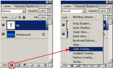
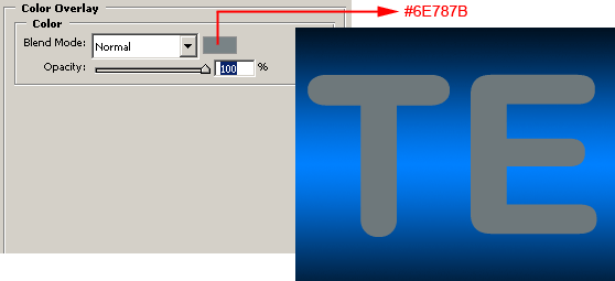
Select the text layer and apply a COLOR OVERLAY LAYER STYLE to it.
We are using a medium gray as the base color of the chrome. Of course, a chromed object don’t have colors, it is a 100% reflective surface. Painting it with gray is just like averaging all the colors it can reflect under an ambient light. Later we will be adding some distortion, shadows and highlights:
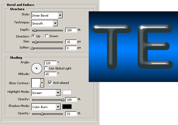
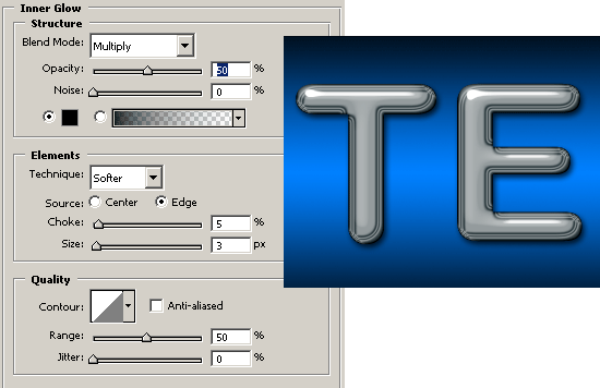
This is one of the most important parts of the effect. Here we will be giving the letters a rounded volume. Using an almost vertical light source and a very sharp GLOSS CONTOUR PROFILE we will obtain some realistic distorted glossy highlights. To create that contour, you have to click on the GLOSS CONTOUR profile swatch and start playing with the curve editor. Since it is too long to explain here, you can download the contour and load it to the PRESET MANAGER following these steps:
1) Go to EDIT > PRESET MANAGER…
2) Click on the PRESET TYPE pulldown menu and select CONTOURS. A group of contours will load on the PRESET MANAGER window.
3) Click on the LOAD button and find the contours (PRChrome.shc) file you’ve just downloaded, load it and then click DONE.
4) Go to the BEVEL AND EMBOSS Layer Style window and click on the little arrow located at the left of the GLOSS CONTOUR swatch. A pulldown window will appear with the new loaded profile. Just select it and you are ready to move on to the next step.
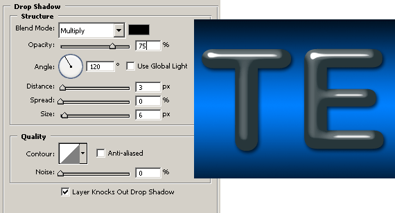
Adding a drop shadow is always mandatory when simulating 3d objects.
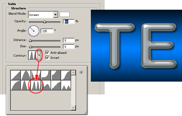
Now, let the magic start. The SATIN effect is great to simulate reflections. With these settings we are simulating a distorted reflection at the edges of each letter.
The previous step would have been enough to achieve a good looking chrome, but let’s ad a couple more refinements to the effect. This sharp inner glow helps to darken the back of the letters just as if it was reflecting the underlying drop shadow.
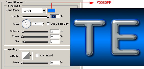
And last, the cherry on the top: Reflecting the background where the letters are placed.
This one is a nice touch because it lets you match the background color (blue #0080FFin this case) to make a better integration of the letters with the environment.
Glossy Plastic Effect
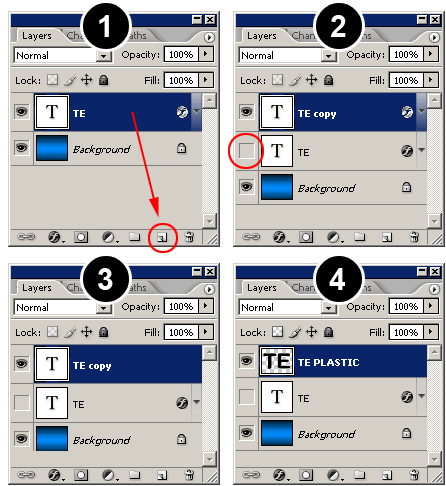
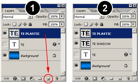
For the plastic effect, we have to duplicate the chrome effect layer to have the plastic letters in the exact same position of the chrome letters:
1) Duplicate the chrome text layer.
2) Click on the layer visibility eye to hide the chrome layer. Select the new duplicate layers and go to menu LAYER > LAYER STYLE > CLEAR LAYER STYLE.
3) Select the new duplicate layer and go to the menu LAYER > RASTERIZE > TYPE. The text on the layer will be converted to graphics and will no longer be editable.
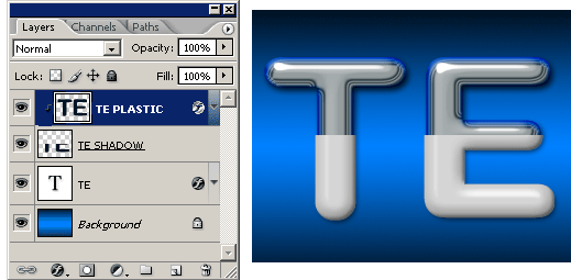
4) Rename the new layer to whatever you want.You must now have a BACKGROUND layer, the Chrome text effect layer (hidden right now) and a new rasterized text layer.
Press the CTRL KEY (COMMAND KEY on Macs) and click with the mouse pointer on the new layer preview thumbnail to load the selection:
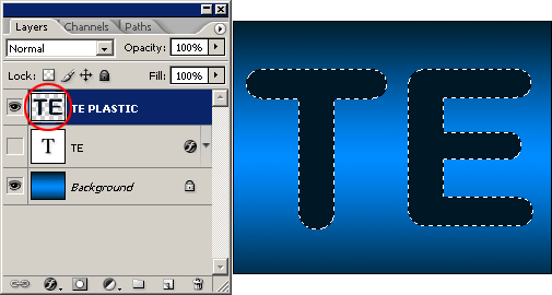
Now go to the menu EDIT > STROKE and set WIDTH: 4px, COLOR: #000000 (BLACK), LOCATION: CENTER and press OK. Go to menu SELECT > DESELECT to deactivate the selection. We thickened the letters by two pixels (two pixels inside the selection and two pixels outside the selection) to help us give an encapsulated look for this effect.
Duplicate the new layer and rename it TE SHADOW or whatever makes sense to you. Then rearrange the layers so the TE SHADOW layer is locate below the TE PLASTIC layer.
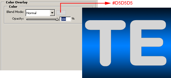
Select the TE PLASIC layer. Go to the LAYER STYLES menu and select COLOR OVERLAY. Use a light gray color to simulate the environment reflection on the white letters.
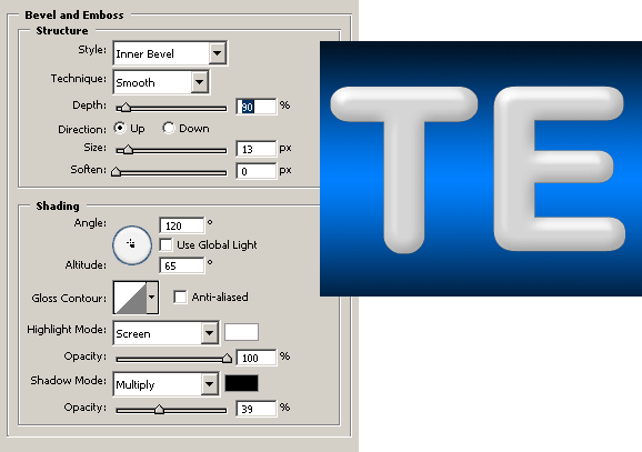
Now add a BEVEL AND EMBOSS using the settings shown in the image below. Notice how the highlights are white or near white and the rest of the letter body is light gray, yet the letters still look like pure white. If we had painted the letters with pure white instead of light gray, the volume of the letters wouldn’t be noticeable, resulting in a flat, overcast lighting.
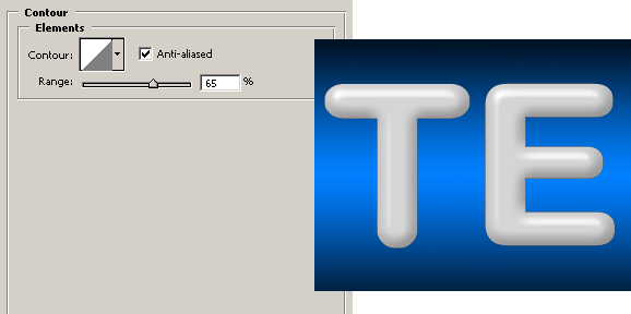
Go to the CONTOUR window, located right under the BEVEL AND EMBOSS checkbox, and copy the settings shown in the image bellow. The CONTOUR layer style is very useful to fine tune the highlights.
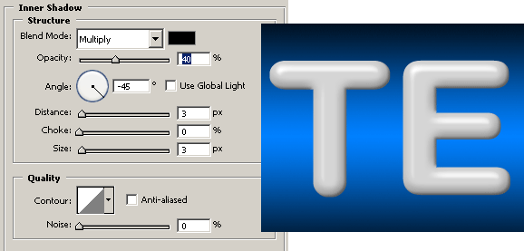
The last step is to add a small INNER SHADOW layer style. This will add a little more volume to the effect.
The plastic effect is finished. Since in the next step we will cut the shape in half, the drop shadow will need to be created using a different technique to avoid an unnatural look.
Creating the Encapsulated Effect
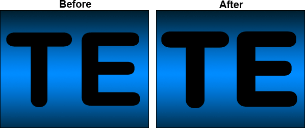
We now have both Chrome and Plastic effects on two different layers. The next step is to create the encapsulated look of the effect. No big mysteries here, just cut half of the plastic text and place it above the chrome text.
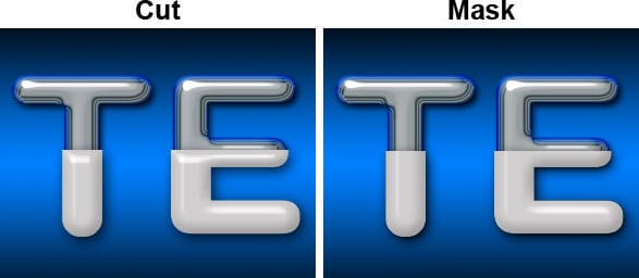
Sadly, we can’t just cut it because the existing layer effects will apply to the new shape. We will have to mask it. Take a look at the image below to see the difference between cutting and masking in the finished effect.
Notice that when you cut the image, the bevel and emboss effect changes to reflect the new shape. Instead, masking or hiding the upper half of the letters leaves the bevel and emboss effect untouched.
Learn how to mask the plastic letters in the next step
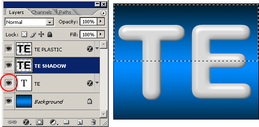
Let’s start with the masking process. First click on the chrome text LAYER VISIBILITY icon to make it visible again and select the TE SHADOW layer.
Using the RECTANGULAR MARQUEE tool select the upper half of the letters and go to menu EDIT > CLEAR.
Go to menu SELECT > DESELECT to deactivate the selection.
In the previous step, the TE SHADOW layer has been cut by half. Now, let’s use that layer to create the mask for the final effect: Select the TE PLASTIC layer and go to menu LAYER > CREATE CLIPPING MASK.
The plastic text has been masked using the TE SHADOW layer.
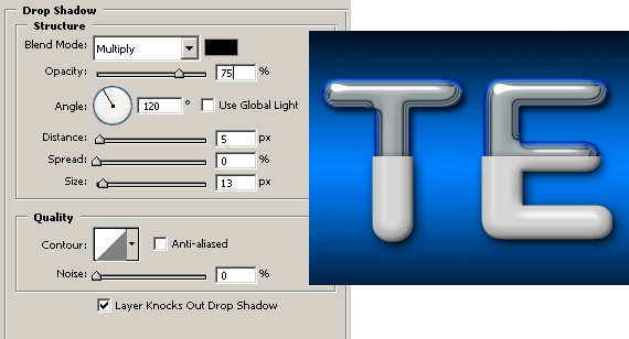
So far, the plastic letters do not have a drop shadow. What you see is the drop shadow from the chrome letters. Since they are bigger, the plastic letters should have a larger drop shadow.
Select the TE SHADOW layer. Go to the DROP SHADOW layer style window and set the settings shown in the image below:
Let’s add some finishing touches to the effect. A tiny bevel will make this effect look more realistic.
Add a new layer and name it TINY BEVEL or whatever you want.
Set BACKGROUND COLOR to white. Then select the PENCIL tool and with a 1 pixel point tip draw a line at the top border of the plastic text:
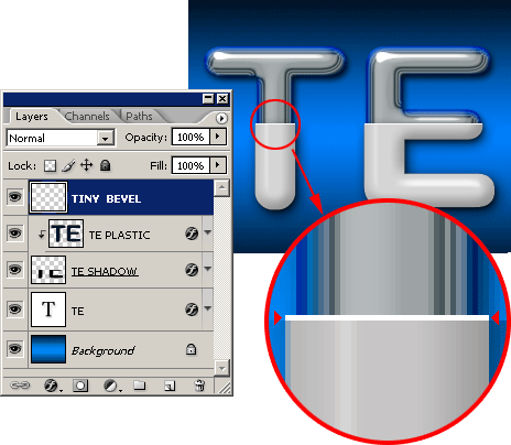
And using the BRUSH TOOL you can paint a small highlight on the lower part of the letter E:

Believe it or not, we reached the end of this never ending tutorial. Check the images below for some samples of this technique used on different shapes.