The Fileteado Porteño is a popular decorative art form typically used in Buenos Aires, Argentina, at the beginning of the 20th century. It was, and still is, usually applied to almost anything from signs, leaderboards, objects, trucks and buses, to mention a few. It is mainly composed of a text element, sometimes an image, and lots of natural decorative elements such as flowers, leaves, and wood. It has a sort of baroque expression and, more importantly, uses Trompe l'oeil techniques, resulting in a faux 3D look that's both pleasant and amusing in some way.
Of course, to create this type of art you have to be not only a skilled artist, but also familiar with the culture behind this form of expression.
This Photoshop tutorial will show you some techniques that you can apply to create your fileteado porteño artwork, such as layer styles and the new awesome 3D Repoussé Photoshop tool.
THIS TUTORIAL IS FOR ADVANCED USERS: Although this type of illustration can be achieved with relative ease by any user with intermediate knowledge of Photoshop, I will be skipping many steps for the sake of making this tutorial readable.
If you don't know how to use Photoshop's basic tools and tasks such as Layer Styles, layer management, and selection tools, read this tutorial anyway. I'm sure you will get something out of it.

The 3D text
Create a new document of 865 x 480 pixels. Fill it with a dark grey color (#272727) just to simulate some kind of blackboard.
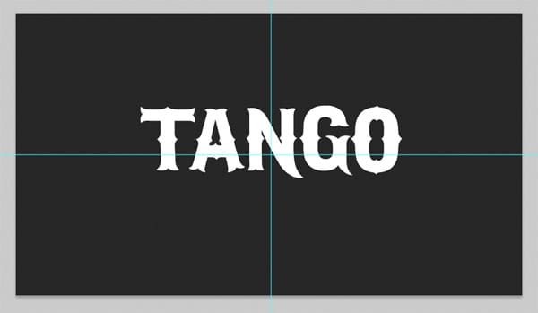
Download and install the IFC Los Banditos font, which is free from DaFont, and type the word TANGO all in caps using a 150px font size. In this step, the text color doesn’t matter. Place the text a little above the center of the image, just like the image below shows.
Now lets give some color to the text. Using Layer Styles, apply a linear gradient to the text, from color #ffd97c to color #ffa511. Then, apply a 3px inner stroke to the text using color #ff840

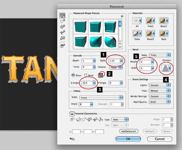
Now let’s give the 3D perspective to the text. With the text layer still selected, go to the menu and select 3D > REPOUSSEE > TEXT LAYER…
This tool is awesome not only because it let’s you extrude the text, but also because it let’s you play with the perspective (in a fake way) without even moving the camera.
1- Set the Scale value to 1.12. This value is very dependant on the font size and position. Play with the scale value until you see almost no perspective. This value represents the scale of the rear end of the 3D text. Because of the perspective, we always perceive the rear end as smaller than the front. Setting this number higher than 1 will scale up the rear end until we get the illusion of no perspective.
2- Select the upper right corner of the Shear mesh. The Shear value will deform the object in a way that will end up as an isometric perspective.
3- Set the Shear X-Angle value to 10.5. Again, if you don’t see the same results, tweak the value until you see a result similar to the one in the image below. Since we selected the top right corner as the Shear center, there is no need to set an Y-Angle.
4 and 5- Now let’s add a bevel to the text. The image below is pretty self explanatory. Just choose the bevel contour and set up a width and height of 5.
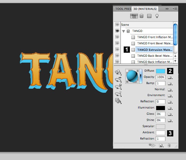
Now go to the menu and select WINDOWS > 3D. We are going to work with the sides of the text.
1- Select the TANGO Extrusion Materials layer
2- Set the Diffuse color to #4DD4FF
3- Set the Ambient color to #FFFFFF
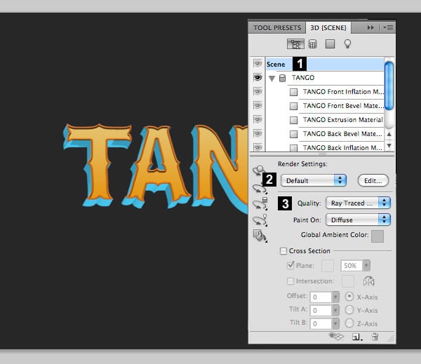
With the 3D Palette still open, let’s set the rendering options.
1- Select the Scene Layer.
2- Set the Render Settings to Default.
3- Set the Quality to Ray Traced Draft. We are not using the highest quality option just because it takes a long while to render and in this case it doesn’t add much to the final result.
In this step we are going to give the 3D text a pained look.
1- With the current 3D text layer selected, go to the menu and choose FILTER > CONVERT FOR SMART FILTER. After this, your layer will be ready to apply a filter but without losing the chance to edit the 3D text.
2- Go to the menu and select FILTER > ARTISTIC > PAINT DAUBS. Use these settings: Brush Size: 3, Sharpness:1, Brush type: Wide Sharp. And then click OK.

Creating the frame
In the following parts of this tutorials I won’t go into much detail on how to draw the ornaments. They are easy to do and you have lots of freedom. But I will certainly show you how to give those ornaments some 3d effect and a painterly aspect.
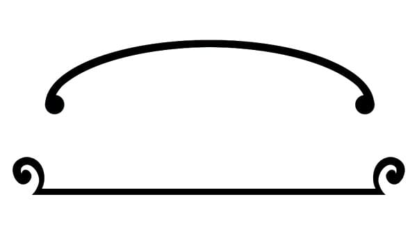
This is the shape we are going to create for the frame:
Create a new layer and draw some ornaments like the ones below. That isn’t such a big deal. I only used the selection tools (rectangle and circle) to draw the shapes.
For example, the upper frame was created with a large oval with a very thick stroke. Then I deleted the lower half and painted two circles at each end. Very simple.
For the lower part of the frame, I draw a long rectangle and then, using the pen tool, I drew some very simple and imperfect, handwork looking, curved ornaments.

The resulting frame should look like this one.

Let’s apply some layer styles to the frame we’ve just created.
1) Color Overlay Layer Style:
– Color: #ff6c00
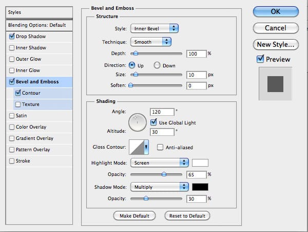
2) Bevel and Emboss Layer Style:
– Style: Inner Bevel
– Technique: Chisel Soft (this one gives a carved wood effect)
– Size: 13
– Angle: 90
– Use Global Light: Checked
– Latitude: 20
– Highlight Mode: Normal
– Highlight
Color: #fff600 (Using yellow simulates a gold leaf coated wood)
– Highlight Opacity: 100%
– Shadow Mode: Multiply
– Shadow Color: Black
– Shadow Opacity: 24%
3) Drop Shadow Layer Style:
– Blend Mode: Multiply
– Opacity: 75%
– Angle: 90
– Use Global Light: Unchecked
– Distance: 5
– Size: 5

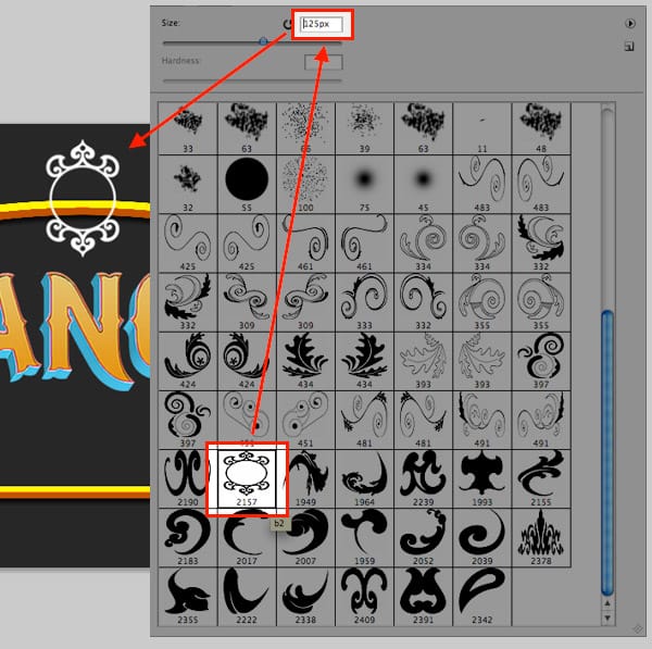
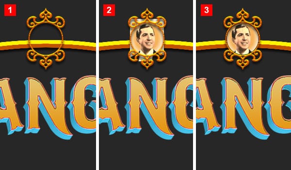
Now let’s keep on building the frame. Download this ornaments brush set, install it and select the Paintbrush tool. Go to the brushes palette and select the brush that is highlighted in the image below. Set the size to 125px and paint the little ornament in a new layer.
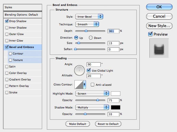
1- Apply a Layer Style (the same as the rest of the frames) to the mini frame. Just tweak the settings to adapt the style to the size of the frame.
2- Now find a nice picture to put inside. I used an old image of Carlos Gardel, but you can use anything that’s related to Tango. Paste the image in a new layer below the mini frame and scale it accordingly.
3- Create a new layer below the image and draw a circle to mask the image inside the little frame.
It is very common to add more ornaments to the text. For example, let’s add some color spheres. You can quickly create some tiny ones with only a couple of brush strokes. Just create a circular selection and start painting with the Brush tool keeping the selection active. You can achieve something similar using a circular gradient.

Now add some of these tiny balls to the lettering. Try a combination of different colors. Don’t forget to add a drop shadow to the text.

Let’s add some ornaments to the lower part of the frame. Download this decorative brushes set, install it and select the Paintbrush tool. Go to the brushes palette and select the brush that is highlighted in the image below and paint the ornament below the text baseline.
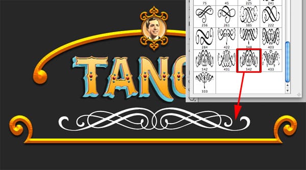
Now apply a similar Layer Style we’ve been using previously in the frame, but this time change the color to something different. Since this ornament isn’t as thick as the frame, you may want to modify the settings to get better results.

Ribbons and flower ornaments
The beauty of this type of illustration is that you have no limits. You can try different kinds of ornaments. In this case we are going to use an ornamental ribbon I purchased from VectorStock. But I’m pretty sure you can easily find some free ones somewhere else on the Web.

Before placing this ribbon in the illustration, apply a Paint Daubs effect (FILTER > ARTISTIC > PAINT DAUB) to make it look like it was hand painted. Play with the settings until you find something that looks good.

Place the ribbon in the lower part of the frame like this:

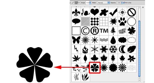
Let’s create some nice flowers. The effect is easy, it is just a matter of coming up with different type of flowers. Remember to tweak the values according to the size of your drawing.
Select the Custom Shape Tool and load the Nature Shapes set that is bundled with Photoshop.
Add the following Layer Styles:
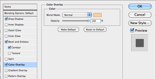
You should end up with something like the following image. Remember that when using Layer Styles, change the values according to the size of the drawing.

Now let’s try another type of flower with the same Layer Style

Let add the finishing touches… Draw a circle and add some Bevel and emboss to it:

Now add the place this circle on top of the flowers, changing colors and sizes accordingly.

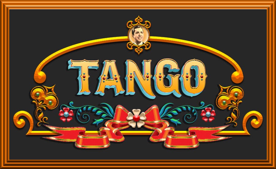
Now add some of these flowers to the frame and that’s it! Check the final result below:
Remember that this is only a basic way of doing the Fileteado effect in Photoshop. This is a complex and highly artistic style and this tutorial was just a quick introduction to the subject.
Check a framed version of the same image