ADVERTISING
Finding quality free fonts licensed for commercial work is difficult and time-consuming. Yes, there are a lot out there, and usually, the ones you always want are not free. But there is one little secret not everybody knows. Many commercial Type foundries offer some styles within their most popular families for you to download for free. Of course, you didn’t know they existed because they are buried inside commercial packages. For this list, I selected 10 beautifully designed font styles that you can download for free.
How to download these fonts
These fonts are offered for free by MyFonts.com, an online store of commercial typography. To download these fonts, you simply have to add them to the shopping cart and proceed to the checkout without paying anything. As a matter of fact, the price for each of these fonts is just $0.
Fertigo Pro

Fertigo Pro. Is a bit like Laphroaig; they say that the more you’ll get to know it, the more you will (probably) appreciate it.
Download Free Style: Fertigo Pro Regular
Haboro

Haboro a new face from insigne Design takes a modern twist on the high-contrast typeface genre known as the Didone. Recognized for their ability to convey clarity, the geometric simplification of the Didone genre adds a level-headed rationality to whichever work it’s applied. Didones are used to lend style and sophistication to a wide number of applications—everything from style or cosmetic labels to annual reports.
Download Free Style: Haboro Nor Regular
Eveleth
Eveleth from Yellow Design Studio is a premium high-resolution letterpress family with exceptional realism and vintage charm. It features 3 different sub-families each with its own unique printed texture. Each sub-family offers six distress options per letter and 3 options for all other characters allowing incredible control and customization. Bonus “spurs” have been included in every weight to add retro flair. Other features include a complimentary Thin weight, a shadow layer, a set of funky icons, a collection of useful shapes and emblems, and clean (non-distressed) versions.
Download Free Styles: Eveleth Icons and Eveleth Shapes
Tenso
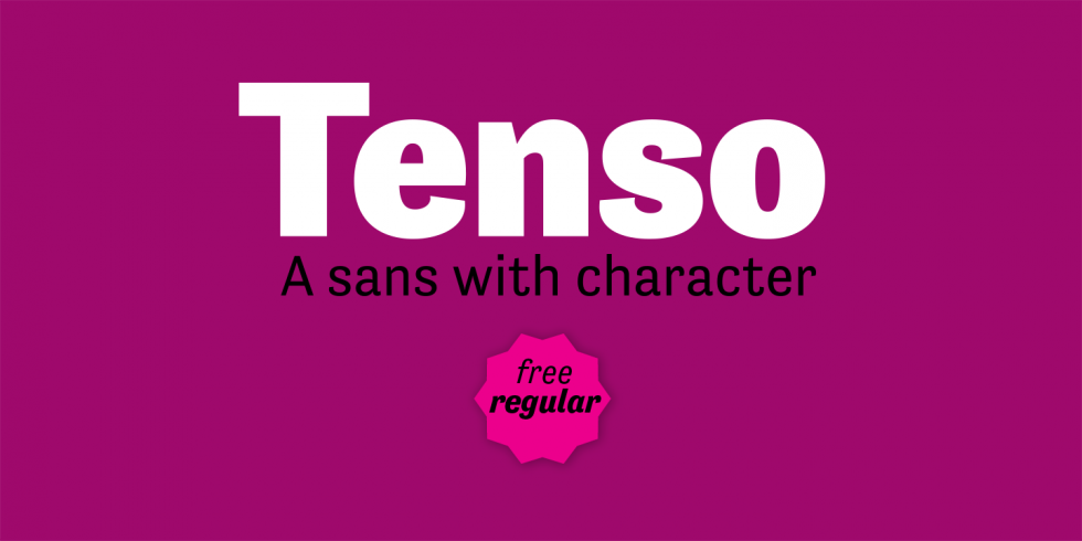
Download Free Style: Tenso Regular
Ethos
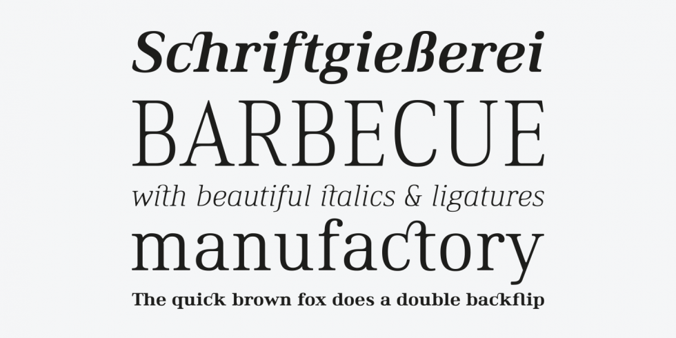
Ethos is a contemporary serif fontfamily by Fonts With Love. It comes in 36 fontstyles with true italics and a huge bunch of opentype features like small caps, ligatures, nominators and denomiators, fractions and many more. Its x-height is pretty high, which makes it legible even on small fontsizes. Above that, the lighter weights have a rather low-contrast linestyle, which improves the legibility on display application especially on smaller sizes. On larger fontsizes, the typeface stands out with a distinctive character of geometrically shaped letters with soft rounded corners.
Download Free Styles: Ethos Regular and Ethos Regular Italic
Sant’Elia Script
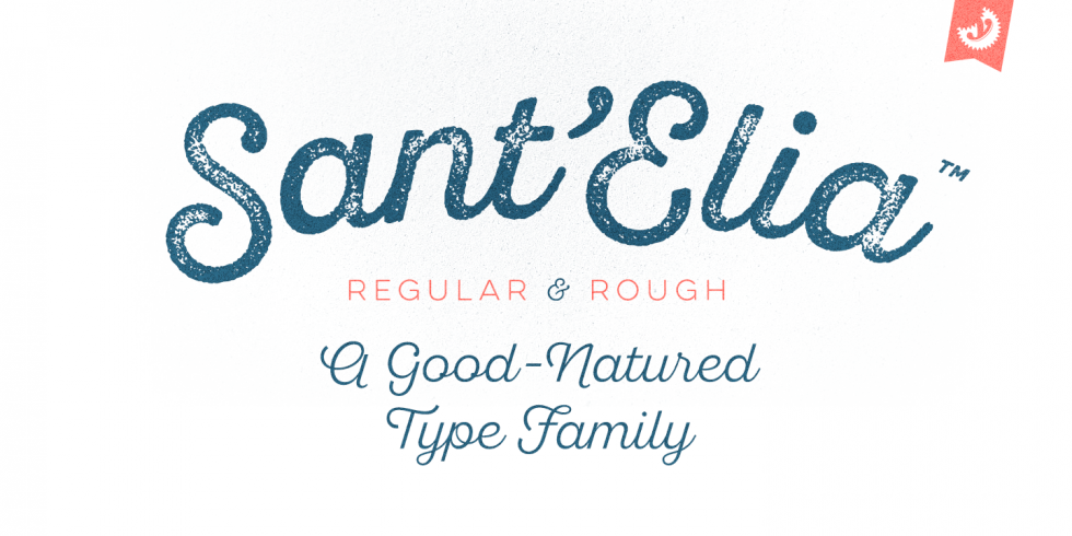
Sant’Elia Script from Yellow Design Studio is a robust modern type family with regular and rough versions in six weights. Its letterforms are crisp and welcoming with a splash of verve. Alternate versions feature angled strokes that inject extra energy. Rough weights include three different distress levels that can be mixed for added control and customization. Try Sant’Elia Rough Line, Line Two and Line Three for free!
Download Free Styles: Sant’Elia Script Rough Line, Sant’Elia Script Rough Line Two and Sant’Elia Script Rough Line Three
XXII Geom
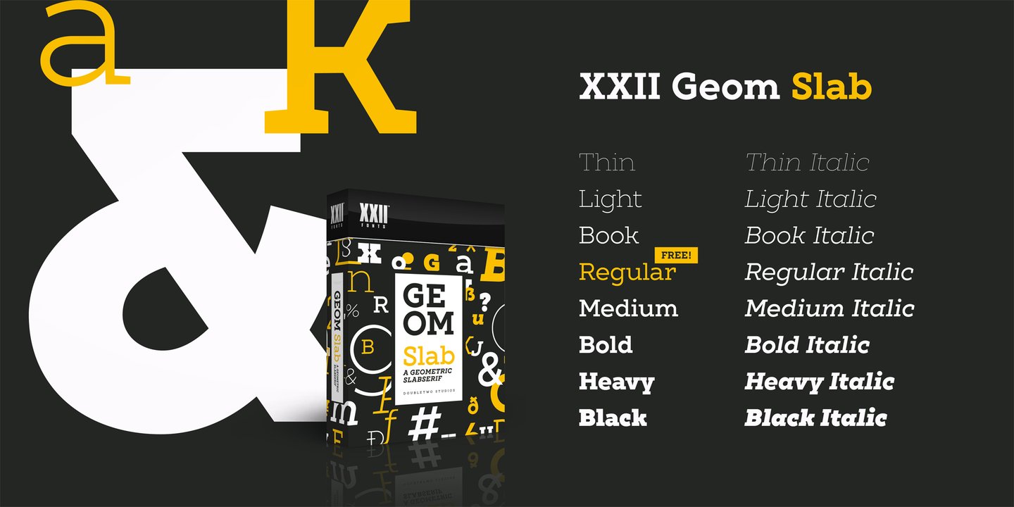
XXII Geom Slab is a modern geometric type system designed with focus on functionality & legibility and with an eye on the old masters.
Its well balanced low contrast letter shapes come with a tall x-height. With its range of Opentype features it is designed to fulfill the needs your content deserves (Smallcaps, Case Sensitives, Ligatures…) as well as serving your individual taste (Stylistic alternates & Sets).
Download Free Style: XXII Geom Slab Regular
Klein

Klein is Zetafonts love letter to the grandmother of all geometric sans typefaces, Futura. Starting from a dialogue with Paul Renner’s iconic letterforms and proportions, Francesco Canovaro and Andrea Tartarelli decided to depart from its distinctive modernist shapes with slight humanist touches and grotesque solutions – with some design choices evoking the softness of humanist sans serifs like Gill Sans.
Download Free Style: Klein Text Book
Garibaldi
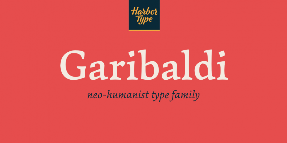
Garibaldi is a text typeface based on humanist calligraphy. It has an organic look and feel, while preserves the traditional construction of roman typography. It all started with a desire to learn more about the origin of the strokes on humanist typefaces. To accomplish that, Garibaldi features a 20° axis, medium contrast based on translation and expansion, asymmetric serifs, and terminals related to the broad nib stroke.
Download Free Style: Garibaldi Medium
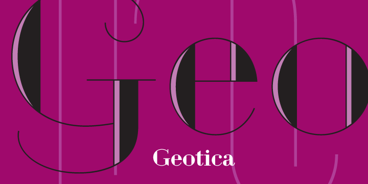
Geotica
The idea behind Geotica was to build a font out of -more or less- simple geometrical line elements. The open wire frame could then be left open or (partially) filled. Geotica comes in four different grades or line thicknesses (One, Two, Three and Four) so it’s suitable for a broad use. Each grade has four styles and is loaded with swashes, final forms, lots of ligatures and ornaments.