

Adobe Photoshop offers a lot of ways to apply color effects to your images. But maybe the Gradient Map adjustment layer is the most flexible and easy to use of them all. With this tool you can apply one of the many great sample gradients provided by Adobe in the standard Photoshop installation. you can create all kinds of color or artistic effects with just one click. And believe me, many, many of them are really outstanding.
In this tutorial we are going to create a psychedelic poster with just an image, a gradient map and a texture.
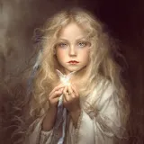
Download the base image. Author: Benjamin Portland. check the usage rights here.

Now, go to the layers palette and click on the ADJUSTMENT LAYERS icon. Select GRADIENT MAP from the list.

A new adjustment layer will be created using the default gradient map. Now, go to the Adjustment layers palette and 1) Click on the gradients pulldown menu 2) Click on the gradients palette options icon 3) Select Spectrums from the bottom of the pulldown menu. Click on Append when requested. 4) Select the color spectrum gradient marked in the image below.

The gradient will be applied to the image giving it a psychedelic style

This is all you need to give a psychedelic look to your image. Let’s now wear it out a bit. Go to the Adjustment Layers icon and choose Hue/Saturation adjustment layer. Then, go to the Hue/Saturation palette and move the Saturation control a bit to the left. -30 is fine. Ugly, isn’t it? Don’t worry. Let’s move on.

Now let’s add a creased grunge paper texture to the image. Download this paper texture by Spiketheswede from Deviant Art. Read the usage rights before using it in any project.

Open the image you just downloaded. Do not paste it into the project file yet. Keep it in a separate file.
You will notice that it is a bit large (1700 x 2246px). So, let’s resize it to 1000 x 1321px using IMAGE > IMAGE SIZE… menu command.
Now that it has been resized, copy the image and paste it into our project. Move the texture until the creases are somewhat symmetrical.
Then set the layer blending mode to Overlay and the opacity to 50%.

Since the texture was a bit light, the colors lost visual impact. Let’s add the final touch creating a new LEVELS adjustment layer right above the texture. Set the black point to something like 25. This will give a better contrast to the image.

This is the final result:

The main color effect was based only in the gradient map layer. The rest of the layers were used to fine tune the result. Since we used Adjustment Layers you can keep on tweaking the image to get different effects.


