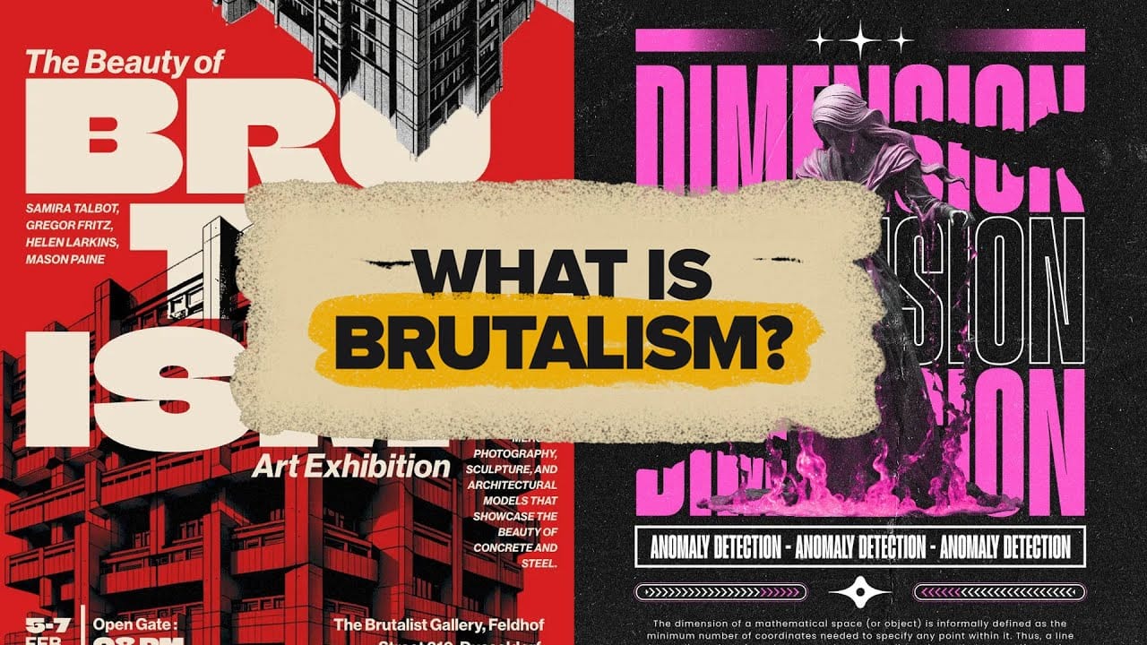
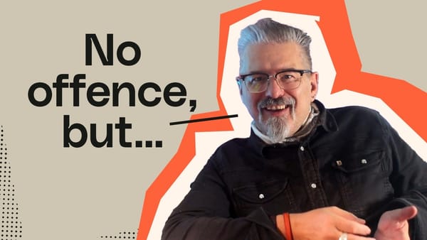
Raw concrete meets bold typography in a design movement that deliberately breaks the rules. Brutalism strips away polish and perfection, embracing rough edges, clashing colors, and unapologetically bold statements that demand attention.
This rebellious aesthetic resonates with audiences tired of corporate gloss and cookie-cutter designs. Fashion brands, music labels, and creative agencies use brutalist principles to stand out in crowded markets and connect with younger demographics who value authenticity over refinement.
Watch the Brutalist Design Tutorial
Video by Spoon Graphics. Any links or downloads mentioned by the creator are available only on YouTube
The Philosophy Behind Brutalist Design
Brutalism emerged from 1950s architecture, where exposed concrete and utilitarian structures rejected decorative elements in favor of pure function.
Graphic design adopted these same principles, creating a visual language that prioritizes honesty over perfection. The movement represents more than aesthetic choices—it embodies a counterculture mindset.
Designers use brutalist elements to signal independence from mainstream design trends and corporate expectations. This rebellious spirit appeals particularly to Gen Z audiences who reject polished, inauthentic brand communications.
Key brutalist principles include:
• Raw, unpolished visual elements that feel genuine
• Grid-based layouts with intentional imperfections
• Typography as the dominant visual element
• Limited color palettes or deliberate color clashes
• Texture and noise that adds human imperfection
Practical Tips for Brutalist Design
- Choose bold, oversized typography that dominates the composition—geometric sans-serifs like Helvetica work well, but mixing chunky serifs adds more chaos.
- Create controlled disorder by placing elements slightly outside grid systems or allowing images to bleed into margins intentionally.
- Use stark color contrasts with black and white foundations, or embrace jarring combinations like neon pink against green.
- Add texture and grain through overlays, noise gradients, or deliberately pixelated effects to mimic the rawness of concrete.
- Break conventional navigation in web designs by making user experiences slightly awkward but memorable.
Related Articles and Tutorials about Graphic Design
Explore more design techniques and creative resources to enhance your projects.
