Web Typography: Essential Principles for Confident Design

Web Typography: Essential Principles for Confident Design

Typography shapes every digital experience we encounter, yet many designers struggle with choosing the right fonts and creating cohesive type systems. The difference between amateur and professional web design often comes down to understanding typographic principles rather than following trends or guessing at font combinations.

This comprehensive tutorial covers the essential principles of web typography, from understanding how people read text to creating scalable type systems. You'll learn practical methods for selecting fonts, pairing typefaces effectively, and building typography that works across all devices while maintaining readability and accessibility.

Watch the Complete Typography Course

Any links or downloads mentioned by the creator are available only on YouTube

The Psychology and Mechanics of Reading

Reading may feel effortless, but your brain performs complex work to process text. Eyes don't move smoothly across lines—they make rapid jumps called saccades, with the brain filling gaps between movements. The length and frequency of these movements depend on reading skill and content familiarity, which explains why technical articles take longer to process than topics within your expertise.

This reading process highlights the difference between legibility and readability. Legibility focuses on recognizing individual letters through clear shapes, proper spacing, and adequate contrast. Readability concerns how easily you can process entire blocks of text, influenced by line spacing, length, font size, and visual hierarchy. Professional typography balances both elements to create natural, effortless reading experiences.

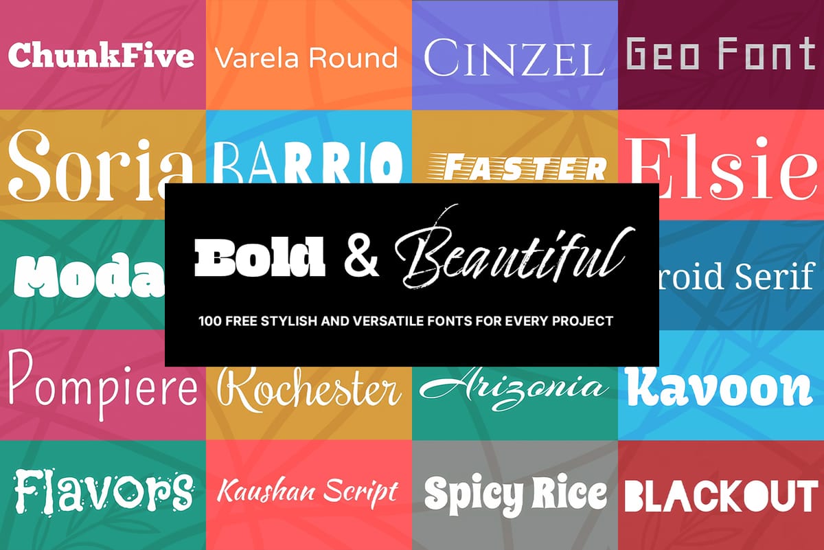
Typography classifications evolved alongside printing technology and cultural shifts. From medieval blackletter through humanist serifs to modern sans-serifs like Helvetica, each category serves specific communication goals. Understanding these historical contexts helps designers choose typefaces that align with project requirements rather than personal preferences.

Practical Tips for Web Typography

  • Match typeface tone to brand identity — Traditional serifs convey authority and trust for professional services, while clean sans-serifs suggest modernity and approachability for tech companies.
  • Test fonts in actual context — Preview typefaces directly in web browsers using real content instead of lorem ipsum to see how they handle varying word lengths and sentence structures.
  • Follow the serif-plus-sans-serif pairing rule — This classic combination provides natural contrast while maintaining harmony, with serif fonts typically used for headlines and sans-serifs for body text and interface elements.
  • Establish proper hierarchy through size and weight — Use a consistent type scale (like 1.333 ratio) to create systematic font size relationships that guide readers through content naturally.
  • Optimize for accessibility — Maintain sufficient color contrast ratios, avoid all-caps for long text blocks, and ensure fonts remain readable at smaller sizes across different devices.

Explore additional resources to deepen your knowledge of typography and design principles.

The Beauty of Letters: Exploring Typography Through AI Innovation
Letters transcend mere symbols; they represent a fusion of form and function. Their shapes—whether curved, angular, bold, or delicate—carry a visual language that resonates with viewers. While familiar, they also hold potential for innovation. Through the lens of artistry, traditional forms can transform into something extraordinary. This is
Download an awesome bundle of 100 high quality free fonts
Are you looking for the perfect fonts to enhance your designs? Whether you’re designing for web, print, or anything in between, a good font can make all the difference. Today, we’re thrilled to share an incredible collection of 100 free font families comprising 471 individual fonts – and the best part?
Create a Typographic Portrait in Photoshop – Photoshop Roadmap
This Photoshop tutorial by Blue Lightning TV takes you through crafting a stunning portrait built entirely from words. Learn to prep your photo, create a text cloud filled with the subject’s special words, and position and manipulate the text to perfectly follow the contours of the face. The video guides
100 Wonderful Photoshop Photo Effects tutorials
Learn how to create awesome photo effects in photoshop with this gallery of 100 impressive Photoshop tutorials.

Get tutorials & freebies delivered to you.

Subscribe to the Photoshop Roadmap newsletter, a weekly roundup of new tutorials, insights and quality downloads, trusted by 6500+ readers.

You might also like

Understanding AI Image Generation: How It Works and How to Use It

AI image generation has transformed creative workflows across industries. Tools that once required extensive technical knowledge now allow anyone to create stunning visuals using simple text descriptions. The technology has evolved from experimental novelty to practical design solution. This Adobe tutorial breaks down the core concepts behind AI image generation...

How to Design with the Y2K Aesthetic: Typography, Colors, and Effects

The metallic surfaces, bubble typography, and neon gradients of the late 1990s and early 2000s have made a striking comeback. This retro-futuristic aesthetic captures the millennium era's optimistic vision of digital technology through shiny textures, holographic colors, and playful design elements. The Y2K revival offers designers a bold...

Understanding Brutalist Graphic Design: Principles, Techniques, and Applications

Raw concrete meets bold typography in a design movement that deliberately breaks the rules. Brutalism strips away polish and perfection, embracing rough edges, clashing colors, and unapologetically bold statements that demand attention. This rebellious aesthetic resonates with audiences tired of corporate gloss and cookie-cutter designs. Fashion brands, music labels, and...

Understanding Grunge Design: Typography, Textures, and Visual Style

Grunge design refuses to play by conventional rules. Born from underground zines and music culture in the late '80s, this aesthetic embraces chaos, imperfection, and raw authenticity over polished perfection. The style thrives on distressed typography, layered textures, and intentional disorder. As digital design becomes increasingly automated and clean,...

Ranking Every Wes Anderson Movie Poster: A Design Analysis

Wes Anderson's films are renowned for their distinctive visual style, but the evolution of his movie poster design tells a fascinating story of creative growth and collaboration. From the raw indie aesthetic of his 1996 debut to the meticulously crafted artwork of recent releases, Anderson's posters...

You’ve successfully subscribed to Photoshop Roadmap
Welcome back! You’ve successfully signed in.
Great! You’ve successfully signed up.
Success! Your email is updated.
Your link has expired
Success! Check your email for magic link to sign-in.