Autochrome was a color positive transparency process developed by Lumiere in 1907 and used by such photography greats as Edward steichen and alfred stieglitz, just to name a few. The process consisted in coating a glass plate with a random mosaic of microscopic grains of potato starch dyed red, green and blue which act as color filters. These rather coarse grains of starch gave a hazy, pointillist effect to the overall image. In the digital age we can recreate this effect with the use of digital noise.
The first thing we’re going to do is to try to recreate the Autochrome color characteristics. One thing to bear in mind is that since this was an early color process, color rendition was not always faithful and constant. Another thing is, from the autochromes I have seen, color deterioration is a big issue. Usually there are alot of color streaks and stains. Sometimes a green color cast developes on certain parts of the image making it difficult to imagine what the original subtle colors might have been. Having said that, no two autochromes are alike. So when working on your image perhaps it would be a good idea to search for examples on the web to get an idea of what kind of colors where achievable. There are however, certain general caracteristics. Usually autochromes were quite dark and low in contrast. This was mainly due to the fact that they needed a long exposure for a proper image and that besides the potato starch dyes, they also had a layer of panchromatic silver hylides emulsion(the stuff found in regular B&W film).

Go to your curves adjustment by clicking on the “new layer adjustment” icon at the bottom of your Layers Palette.

Starting with the red channel, what we want to do is to drop the curve a bit. Do this by creating a new point there in curve and setting the Output to 120 and the Input to 130. You can make the curve dip a little deeper depending on the image but you want to avoid a green color cast.

With the green channel you want to make the same curve only this time, make sure to stop before you get a magenta cast.

With the blue channel we want to take it a little further. In this case I gave it an Output of 150. Usually Autochromes were more in the warm side of the color palette.

What this curve adjustment will do is give you image a warm pastel look but we want it even warmer so open your Photo Filter adjustment layer.
The Photo Filter will act as if you have taken your photograph with an actual color filter on your lens. Autochromes used an additional special orange-yellow filter in the camera mainly to block ultraviolet light and restrain the effects of violet and blue light which were parts of the spectrum to which the emulsion was overly sensitive. In this case, we’re going to choose a Warming Filter (85) and set it’s Density to 50%. This value can vary depending on your image.

The next thing I want to do is to modify some specific color by using the Selective Color adjustment layer. I like deeper blacks so I’m going to add 10% to them. For this image, the whites have been a little bit darkened by all the warmth so to make them pop again I’ll simply select them and give them a -100% value. This might depend on your image.

Another characteristic of the Autochrome process was the subdued saturation. We can achieve this by opening the Hue/Saturation adjustment layer and decreasing the value of the Master saturation by -20%. You can also tweak the saturation of specific colors depending on your image but this is the fastest way of going about it.

Once we have finished applying these color adjustment layers we are going to merge them in a new layer. The easiest way of doing this is by pressing SHIFT + CTRL + ALT + E. Name this layer Noise and convert it to a Smart Object by right-clicking on the layer and selecting “convert to Smart Object”. This step is important because by using smart filters you will be able to correct and modify the degree in which you apply the Filter effects giving you more control over your final image.
You will notice a small icon has been added to the preview image of your layer indicating that it is indeed a smart object.

What we want to do to this filter is recreate the effect of the potato starch dyes found in Autochromes. If you ever see an autochrome up close, these dyes resemble noise in digital images. We can add noise to our image by using the Add Noise filter found in Filters > Noise > Add Noise…
Now the amount of noise you want to add will depend entirely on the size of your image but keep it on the low side. Make sure to have your image set to 100% to see what the noise looks like. If you added to much and the image looks unrealistic, simply double click on the Add Noise filter layer to readjust the value. Also, set the Distribution to Gaussian for a more random noise structure.

To finish off, we’re going to add some Gaussian Blur to the image. Go to Filters > Blur > Gaussian Blur…
What we want to achieve here is simply blend those noise particles together. Blur them out to make them look more realistic and less “digital”. Just add a little tiny bit. We don’t want the image to go completely out of focus. Again this value will depend on the size of your image and how much noise you’ve added to it.

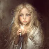
That about does it! Your layers palette should look like this. Hope you’ve found this tutorial useful and continue to explore Photography’s rich past. Here’s a before and after comparison.

Before and after: