Back in the day, when one would print their own black and white prints, you had a choice of a zillion different papers. They basically boiled down to cooltone and warmtone papers. This combined with different developers gave one an array of tones to choose from for any given picture. Sadly, nowadays it’s getting harder to find specific papers and certain developers are no longer being manufactured. In the digital era, most people who might not have gone through the trouble of trying different tones of paper (or even B&W printing for that matter) will be satisfied with converting a color image to a straight B&W palette by simply desaturating the color. Today we’re going to take it a step further. Achieving different tones for specific images will help you create different moods according to the overall look you’re going for.

Cooltone Effect
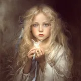
Let’s to start of with a cooltone effect. First thing we need to do is convert the color image to Black & White by using the Black & White layer adjustment found at the bottom of your layers palette. This will bring up the Black and White conversion window from where you can choose a variety of predefined adjustments that simulate different photo filters. Choose the filter setting most suitable for your image. You can also leave it in “Default” and tweak each color rendition separately. In my case, I used a mix between a high contrast blue filter to light up the highlights and a red filter to darken the clouds and shadows by masking out the areas with the adjustment layer’s mask. Now that we have a Black & White image we’re ready to cool it down!

Next thing we’re going to do is open up our curves adjustments window. I’m going to show what your red channel, green channel and blue channel should look like. Basically what we want to do is remove some red from the midtones, a little tiny bit of green and then add some blue. Carefull with the green curve. If you subtract too much the tone will have a magenta cast, if you subtract too little and the blue will be more of an aqua tone.


Now, for the effect to look natural what we want to do is to bring it down a bit. One way to do this is by simple using the opacity slider for this adjustment layer to say, 50%. Not only that but, for a more realistic effect, we’re going to mask out some of the midtones and highlights and leave the shadows with a black blue hue. To do this, select the layer mask and go to Select > Color Range. There you can select the tones you want to subtract by simply clicking on the image with the drop icon. Click on a middle grey and then check the “invert” checkbox. This way you’ll recover some pure white and the overall image won’t look so murky blue.

As you are doing this, you can see the same selection on your layer’s mask as the one in your color range window. All you have to do is press OK.
If for any reason you want to modify your selection, simply click on the mask while holding down the CTRL key. Now that you have your layer’s mask selected you can go to Select > Refine Edge. In this window you can tweak your selection by using a variety of sliders to feather and smoothen the edge of your selection.

If you want to check out your layer’s mask on screen, just press on it while holding down the ALT key. Now you can modify using your black and white brush any specific area. For more unobtrusive modification be sure to drop the opacity level on the brush as well as the hardness of it.

Warmtone Effect
To achieve a warmtone effect we’re going to create a different curves adjustment. Now, the difference between this effect and say, a sepia effect is that warmtone B&W paper when not toned in sepia toners has a natural warmth to it. The midtones have more of an olive tint to them where as the white is more of a creamy palette. These papers are especially responsive to toners but have a very interesting color palette all to themselves. This is what we’re looking to recreate.
Go ahead and turn off the curves adjustment layer you’ve just created by clicking on the little eye and open a new curves adjustment layer. This time, recreate the following curves for your red, green and blue channel:


As you would expect, we’re doing quite the opposite as before. Instead of adding a whole lot of blues, we’re subtracting them. Also, we’ll need to take away a little bit of red and green. As you did previously, go ahead and use color range to select the midtones in your layer’s mask. In this case, I dropped the opacity to 70%.

That’s pretty much all there is to it. I hope you found this tutorial helps to add a little style to your B&W images.
Here’s your before and after pics:
Original Image:
Cooltone Image:

Warmtone Image: