Photoshop's built-in Color Halftone filter creates rigid, geometric results that lack the authentic character of vintage print work. The filter also fails to produce true CMYK separations in RGB documents, missing the black channel entirely and creating an unconvincing simulation of traditional printing methods.
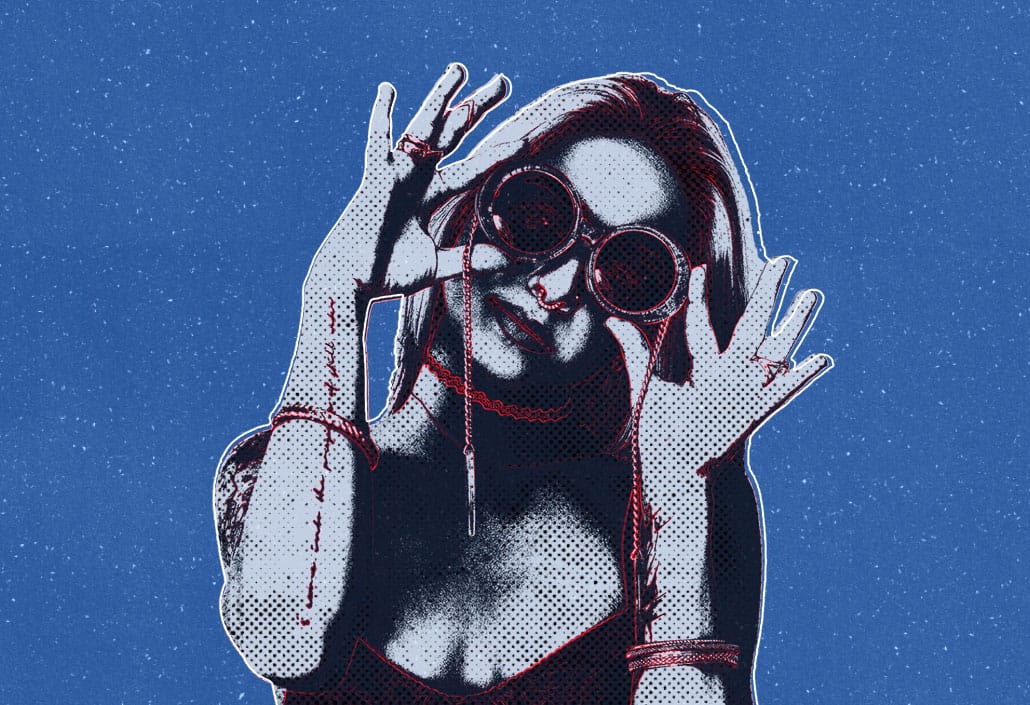
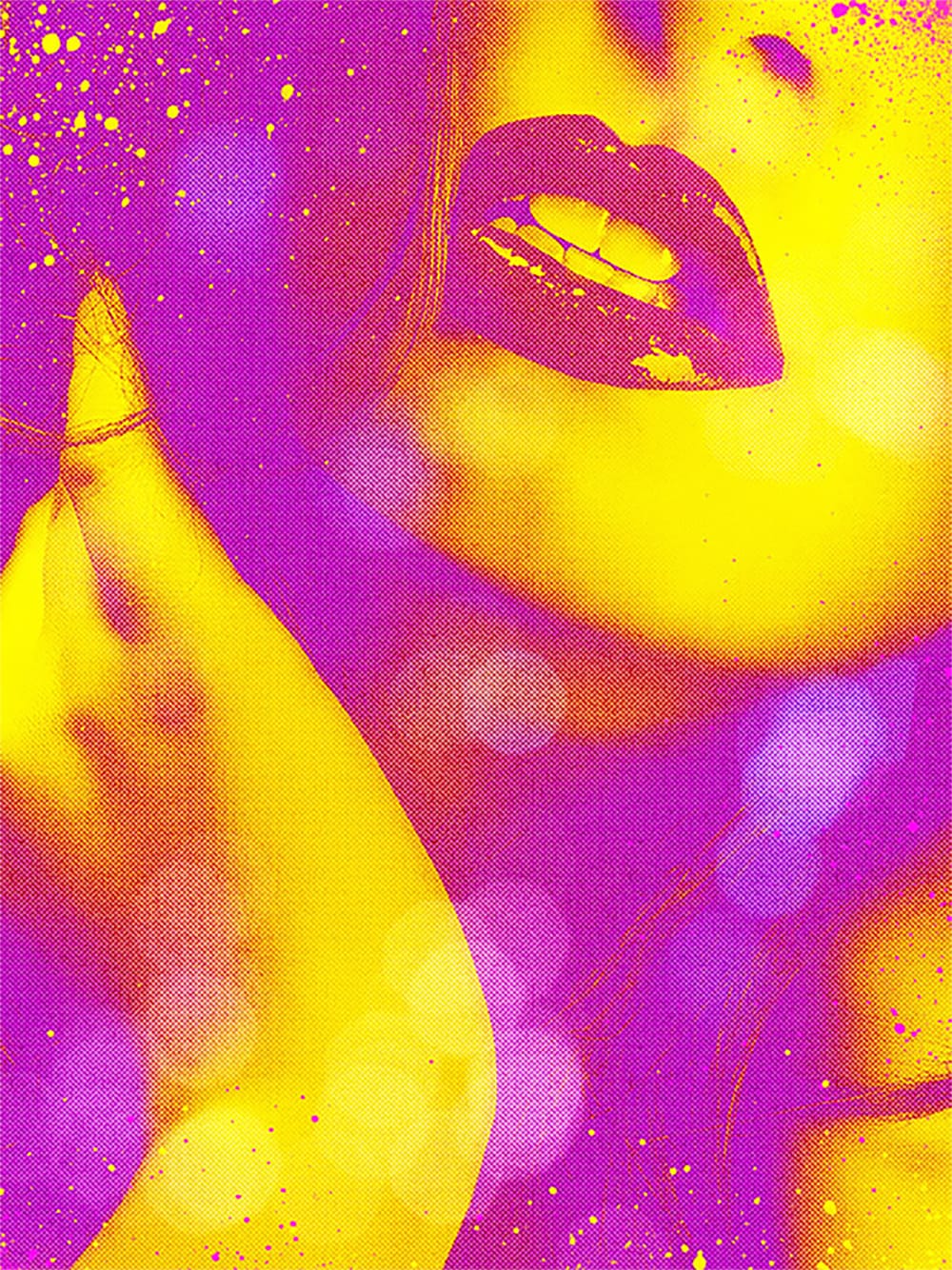
This technique uses custom patterns and blend modes to create realistic, grungy CMYK halftones that work as live effects. Unlike the standard filter, this approach produces authentic-looking ink separations with organic texture and maintains quality at small scales, perfect for vintage magazine aesthetics and print simulation work.
Watch the Tutorial
Any links or downloads mentioned by the creator are available only on YouTube
Understanding CMYK Channel Separation
Traditional halftone printing relies on four separate screens—cyan, magenta, yellow, and black—each angled differently to prevent unwanted moiré patterns. Each screen converts continuous tones into dots of varying sizes, with larger dots representing darker areas and smaller dots representing highlights.
Photoshop processes these channels independently, which explains why the Color Halftone filter behaves differently in RGB versus CMYK documents. In RGB mode, black results from overlapping cyan, magenta, and yellow dots, while true CMYK printing uses dedicated black ink for better contrast and detail.
The Hard Mix blend mode becomes crucial in this workflow because it creates a threshold effect, combining pattern and image data to determine dot sizes. This mathematical approach mimics how traditional photomechanical processes converted photographs into printable halftone screens.
Essential Halftone Pattern Techniques
- Work in CMYK color mode from the start to ensure proper four-color separation and authentic black channel behavior throughout the process.
- Use
Hard Mixblend mode with reduced fill opacity to create smooth dot edges while maintaining the threshold effect that determines halftone dot sizes. - Apply Gaussian Blur to source images proportional to dot size—too much detail fights against the halftone pattern and creates muddy results.
- Add
Levels adjustmentsbelow pattern layers to control dot size ranges and target specific color channels for custom contrast adjustments. - Layer Screen mode textures to simulate paper grain and ink transparency, making solid colors appear more like authentic printed materials.
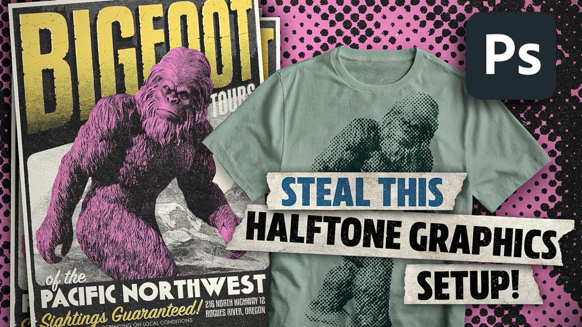
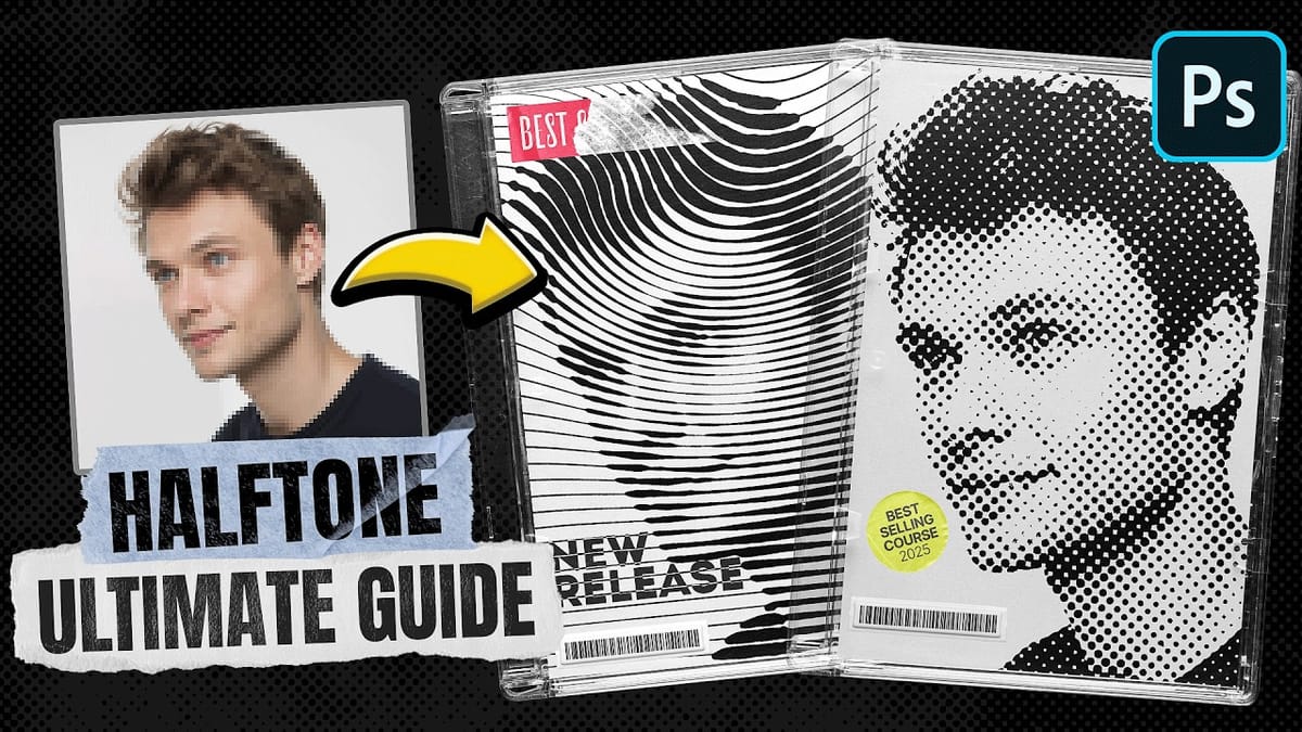
More Vintage and Halftone Resources
Explore additional techniques for creating retro and halftone effects in Photoshop: