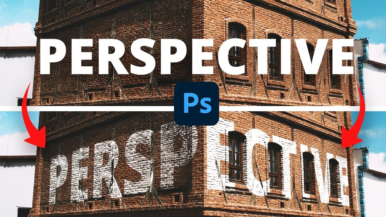
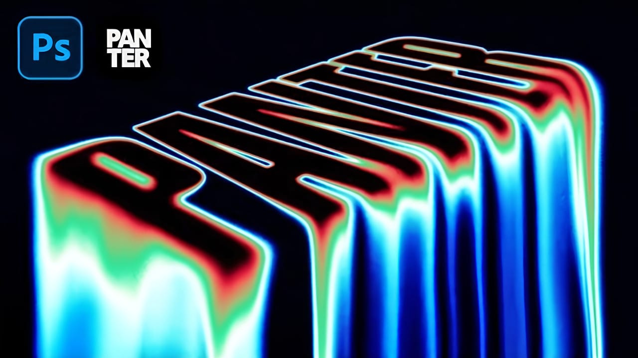
Stretched perspective text creates dramatic visual depth by transforming flat typography into architectural-style elements that appear to recede into space. This trendy effect, popular in poster design, gives text a building-like appearance with multiple vanishing points.
The technique involves manually cutting, duplicating, and connecting text segments using selection tools and careful layer management to build convincing perspective distortion.
Watch the Video
Video by P A N T E R. Any links or downloads mentioned by the creator are available only on YouTube
Practical Tips
These key techniques will help you achieve clean, convincing perspective stretching effects:
- Use condensed bold fonts like Roboto Condensed Bold for better readability when stretched
- Always rasterize your text layer before cutting to avoid font dependency issues
- Create guide rectangles to visualize where your stretched segments should connect
- Use the Polygonal Lasso Tool for precise corner-to-corner connections between text segments
- Work on separate layers for each connecting element to maintain editing flexibility
Related Articles and Tutorials
Explore more creative text effects and typography techniques with these tutorials:
100+ Brilliant Photoshop Text Effects: The Ultimate 2026 Roundup
You won’t admit this: You spend hours making text look like liquid gold. Not for clients. Not for your portfolio. Just because. Here’s the thing: Text effects are your guilty pleasure. You tell yourself you’re “practicing.” You say you’re “building skills.” But really? You just love watching letters transform into
Quick and Easy Perspective Text in Photoshop
Integrating text seamlessly into photographic scenes can improve a design, making static words appear as if they are a natural part of the environment.
Learn how to use Photoshop's Vanishing Point filter to map text seamlessly onto different surfaces, maintaining the image's perspective for a realistic result.
Watch the Video
Practical Tips for Integrating Perspective Text
* Select a bold font for your text to ensure maximum legibility and visual impact once the perspective transformation
Colorful Painted 3D Text Effect Tutorial in Photoshop
Creating eye-catching text effects can transform any design, making it dynamic and engaging. This tutorial offers a unique approach to developing impactful 3D text directly within Photoshop, focusing on a hand-drawn, artistic style.
Learn to build a compelling visual experience using creative Photoshop techniques, including layering, shading, and intricate detailing. This method gives typography a vibrant, three-dimensional appearance without relying on traditional 3D software.
Learn to Creat
Epic 3D Text Effects in Photoshop
Transform ordinary text into dynamic 3D visuals using Photoshop's 3D workspace. This tutorial will guide you through creating stunning typographic effects, adding captivating depth and realism to your designs.
You'll learn to build foundational 3D shapes and refine them with Photoshop's compositing tools, combining 3D extrusion precision with artistic freedom for polished, professional results.
Watch the Full Video Tutorial
Integrating Photoshop's 3D and Compositing Workflows
Photoshop's 3
Easily Create 3D Text in Photoshop
Three-dimensional text adds significant visual impact, giving designs a sense of depth and dimension that can make elements stand out. It's a popular technique for headlines, logos, and graphic elements seeking a dynamic appearance, moving beyond flat designs.
This guide explores a straightforward method for creating a compelling 3D text effect in Photoshop, focusing on a technique that leverages layer manipulation and a powerful shortcut to build depth efficiently without complex 3D modeling t
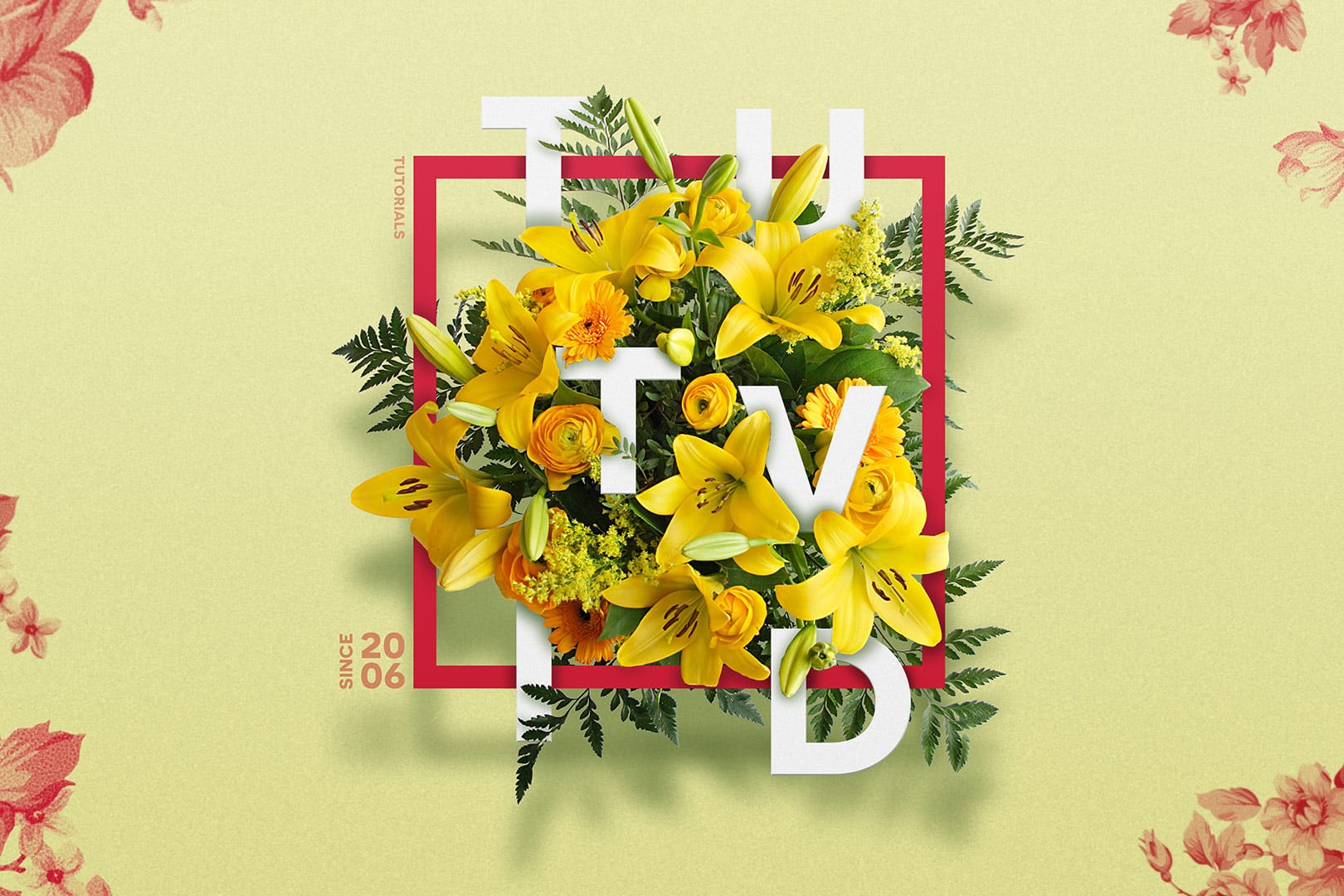
Create a Floral Typography Text Effect in Photoshop
Learn to create stunning floral typography in Photoshop. This tutorial teaches you to blend vibrant flowers with custom text, achieving a captivating visual that seamlessly integrates botanical elements with your design. Master techniques for realistic depth, perfect for unique posters, art, or personal projects.
Watch the Full Tutorial
Practical Tips for Crafting Floral Text Effects
* Convert masked images to Smart Objects early in the process to maintain editability of layer masks and tr
Create Liquid Melting Acid Text in Perspective in Photoshop
Acid text effects capture the raw energy of corrosive transformation, turning ordinary typography into flowing, organic shapes that appear to melt and dissolve. This distinctive visual style suggests powerful forces reshaping matter itself, creating text that seems alive with chemical reaction.
The technique transforms flat letters into dimensional, perspective-distorted forms using strategic blur effects, liquify tools, and gradient mapping to achieve that signature melting appearance.
Watch
Create a Typographic Portrait in Photoshop
This tutorial explores a creative method for transforming a standard photographic portrait into a unique work of art composed entirely of text. It demonstrates how to combine typography with image manipulation to create a visually compelling and personalized artistic statement.
Viewers will learn how to prepare an image, generate and integrate custom text, and apply advanced Photoshop techniques like displacement mapping to achieve a stunning, text-based artwork that subtly conforms to the cont

How to Create a 3D Retro Text Effect in Adobe Photoshop
Transform your designs with a classic retro text effect in Adobe Photoshop. This tutorial guides you through creating popular vintage styles, featuring 3D appearances and decorative elements like inset faces.
Learn how to achieve these striking visuals using a combination of powerful Photoshop techniques, ensuring your text remains fully editable and dynamic.
Watch the Video
Leveraging Smart Objects and Advanced Layer Styles for Retro Aesthetics
Achieving a complex retro text effect in Pho

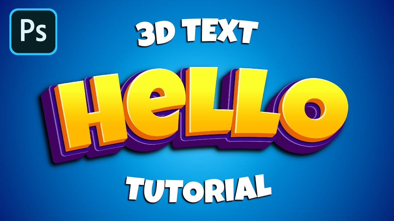
How to Make a Cartoon 3D Text in Photoshop
In this Photoshop tutorial by Learning Screen, you will learn how to create colorful, funny cartoon-style 3D text.
The tutorial guides you through the process of using various Photoshop tools and techniques to achieve a vibrant, playful text effect that stands out. The resulting text is bold and eye-catching, perfect for playful and energetic designs. This tutorial is ideal for projects like posters, children's book covers, or any other creative work that benefits from a fun and dynamic headlin
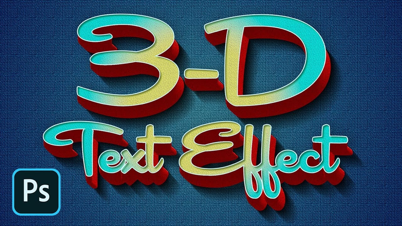
How to Create a Retro 3D Text Design in Photoshop
Retro design remains captivating, offering a nostalgic aesthetic that enhances modern projects. Dynamic 3D text effects are a powerful way to integrate this vintage charm into digital art, transforming flat typography into eye-catching, dimensional elements.
This tutorial comprehensively guides you through creating compelling retro 3D text in Photoshop, teaching essential techniques for depth, intricate layer styles, and using Smart Objects for flexible, editable designs.
Watch the Video
Un