
Color choice is what separates a flat photo edit from a convincing movie poster. This tutorial walks through how to apply triadic color harmony to a single street photograph, using yellow as the dominant tone with controlled accents of blue and red to create visual tension and draw the eye to the subject.
Watch the Video
Video by Nucly • Photoshop and Creative Design Training. Any links or downloads mentioned by the creator are available only on YouTube
Practical Tips
These techniques from the tutorial can be applied to almost any portrait or street photo you want to turn into a poster.
- Use Camera Raw's guided geometry lines to straighten symmetrical compositions before any color work — small alignment issues become obvious at poster scale.
- When shifting reds toward yellow with Hue/Saturation, mask the adjustment off skin tones immediately to avoid an unnatural, jaundiced look.
- Reinforce your accent colors on specific elements — push the subject's clothing toward blue with Curves by pulling down the red channel and boosting the blue, creating contrast against a warm background.
- Add gradient layers above and below the composition (foreground to transparent) to darken the edges and create a natural backdrop for legible title text.
- When setting title lettering, keep line spacing slightly wider than word spacing — this prevents the layout from feeling cramped and follows basic typographic proportion rules.
Related Articles and Tutorials
More tutorials on poster design, color grading, and cinematic image treatment below.
Create a retro '50s Sci-Fi poster in Photoshop
Achieving a distinct vintage sci-fi aesthetic often involves intricate color manipulation beyond simple desaturation. This tutorial demonstrates a surprising approach to color grading, using specific color balance adjustments across shadows, midtones, and highlights to infuse a retro tone. For instance, cyan/red is pushed to +100 in all three tones, while yellow/blue is consistently set to -100.
This precise method, combined with the Diffuse Glow filter and careful Brightness/Contrast settings,
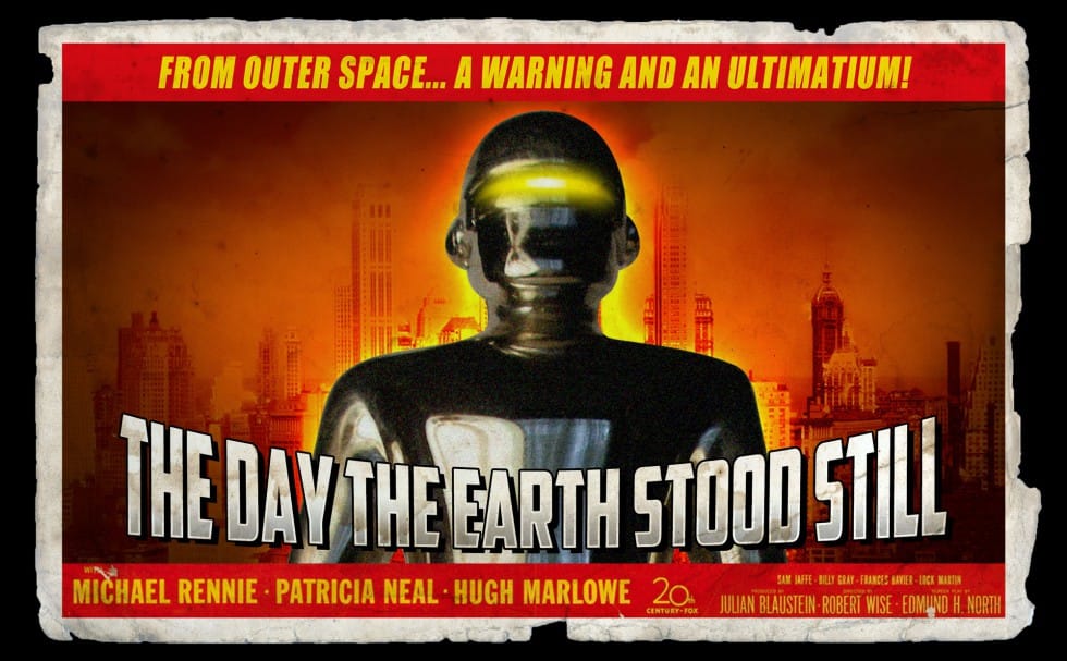
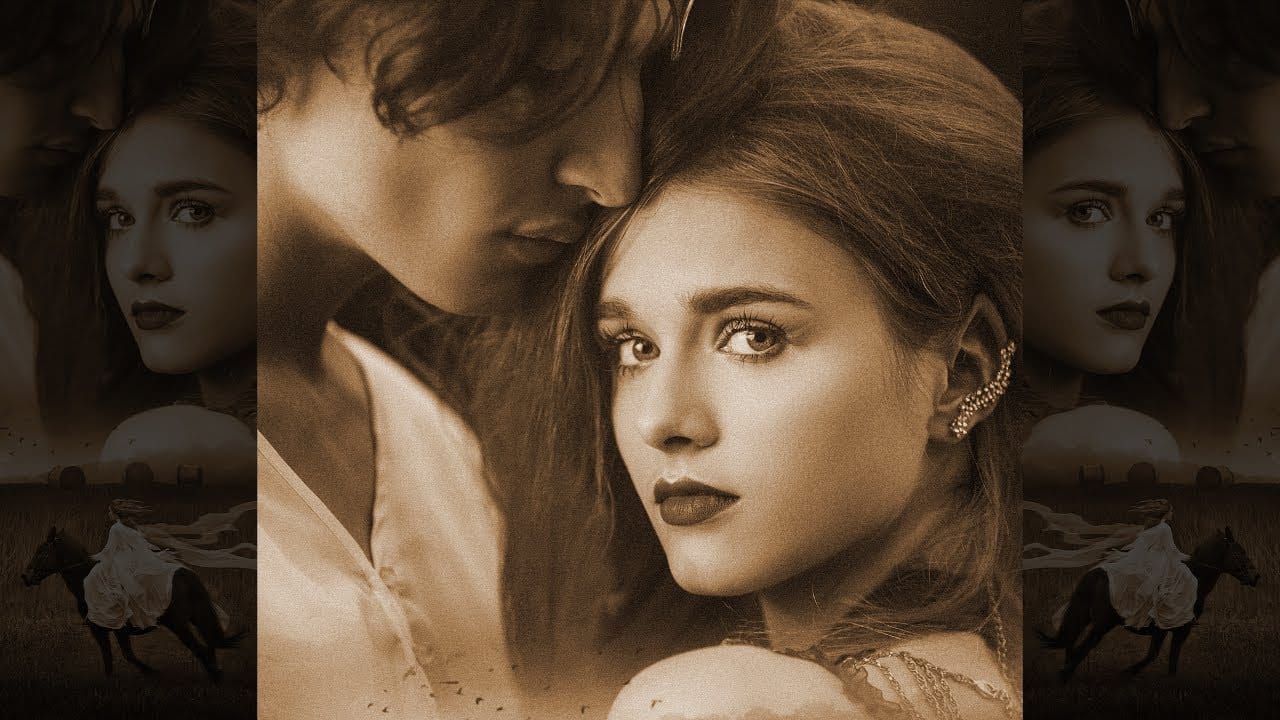
Blend Two Photos Like A Hollywood Movie Poster
This presentation guides you through the process of blending multiple photos in Photoshop to design your unique movie poster. It begins with a straightforward approach, moving your selected images into a single document. Positioning these images correctly is crucial as it sets the foundation for your poster.
Next, you'll use a layer mask to blend the images together, creating a unified look. To enhance the seamlessness of the blend, the tutorial recommends merging layers and adding subtle textu
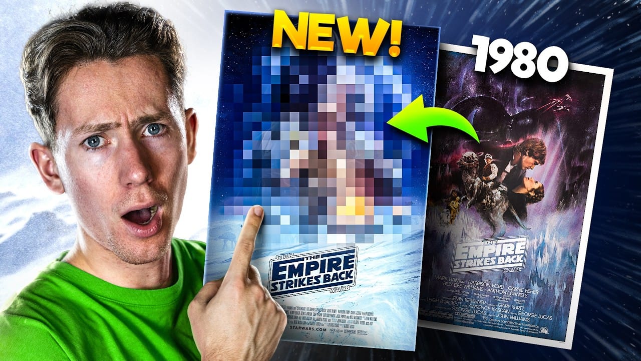
Redesigning a Classic Star Wars Poster in Photoshop
Creating compelling digital art, especially when working with existing iconic material, often presents unique technical and creative challenges. Sourcing high-quality images for older films can be a significant hurdle, leading to compromises in detail and overall visual fidelity. Furthermore, maintaining a consistent design style across a series while allowing for personal skill development over time requires thoughtful execution.
This tutorial provides insight into overcoming these common frus
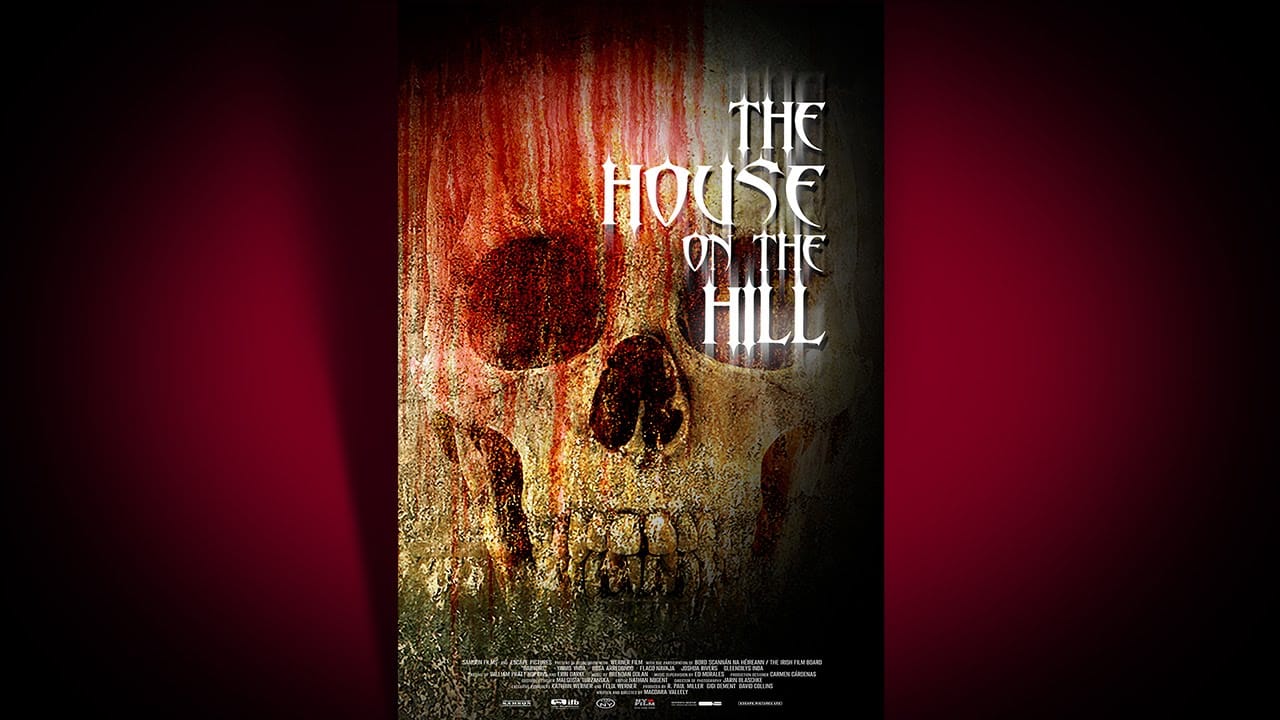
Create a Bone-Chilling, Horror Movie Poster in Photoshop
This video tutorial guides you through the process of designing a compelling horror movie poster in Photoshop. It demonstrates how to combine various elements to achieve a chilling visual narrative.
Viewers will learn practical techniques for image manipulation, including creating realistic textures, applying dramatic lighting, and integrating custom typography, all essential for crafting effective cinematic artwork.
Watch the Tutorial
Visual Storytelling in Horror Posters
Horror movie pos
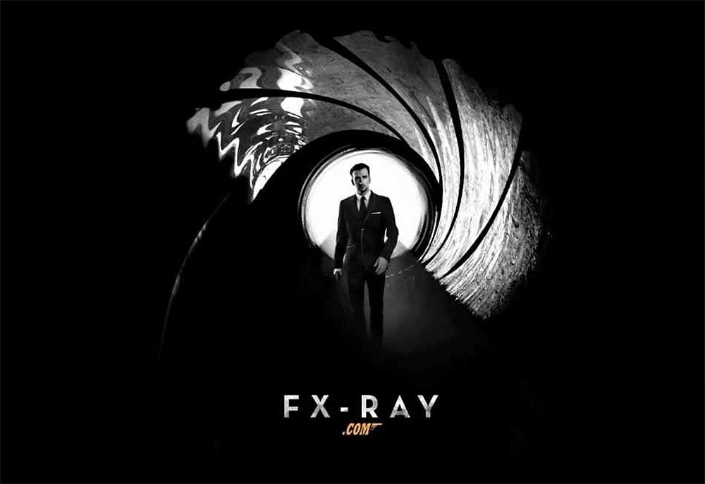
Create a Sky Fall Inspired Movie Poster in Photoshop
If you're looking to create an eye-catching movie poster in Photoshop, this guide offers a straightforward approach to designing a dark, black and white James Bond-inspired piece, reminiscent of Skyfall.
You will start with essential techniques, including layering, blending, and using filters to achieve that cinematic feel. Each step is well-explained, allowing you to understand the process clearly.
You'll learn how to manipulate images effectively, ensuring that every element of your poster a
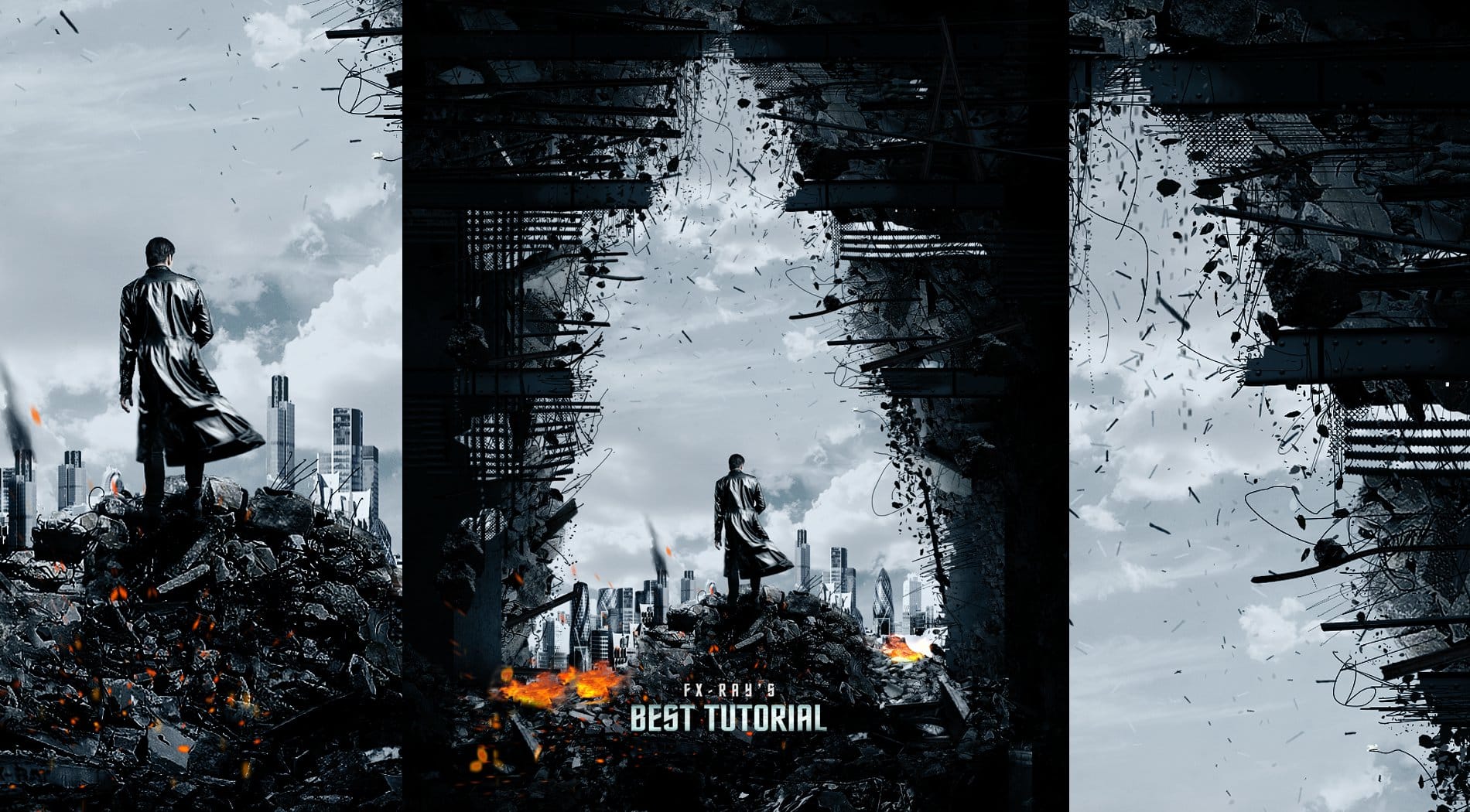
Create a Star Trek Inspired Poster
In this tutorial, you will discover how to create a striking poster inspired by the film "Star Trek Into Darkness." This guide focuses on using straightforward techniques, making the process accessible for everyone.
You will start by learning how to paint effectively using special brushes that will help you achieve a vivid and dynamic look. The tutorial emphasizes the importance of texturing, which adds depth and interest to your poster. By following the steps outlined, you will learn how to in
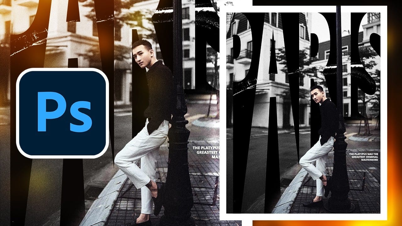
Create a Vintage Paris Poster Design in Photoshop
Vintage poster design captures the timeless appeal of classic advertising with its bold typography, dramatic imagery, and weathered textures. This aesthetic combines strong compositional elements with subtle aging effects to create designs that feel both nostalgic and contemporary.
This tutorial demonstrates how to build a stylized Paris poster using fundamental Photoshop techniques including text manipulation, layer masking, and blending modes to achieve that coveted vintage look.
Watch the
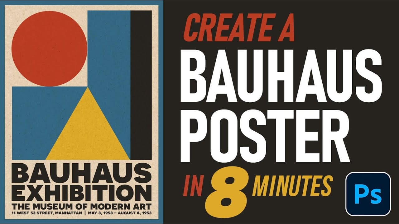
How to Create an Authentic Bauhaus Poster Design in Photoshop
Bauhaus design represents one of the most influential movements in modern visual communication, characterized by geometric precision, bold typography, and a limited but striking color palette. This minimalist approach prioritizes functionality while creating powerful visual impact through the careful arrangement of basic shapes and clean lines.
The authentic Bauhaus aesthetic combines primary colors with stark geometric forms to create compositions that feel both timeless and contemporary. Mast
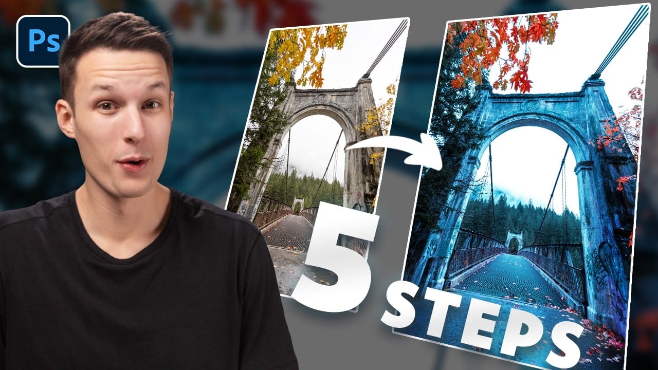
How to Create Dramatic Colors in Photoshop: A 5-Step Color Grading Process
Photography often captures moments in natural tones, but sometimes an image calls for something bolder. Dramatic color grading transforms ordinary photos into striking visual statements that grab attention and evoke emotion.
This comprehensive approach combines Camera Raw adjustments with Photoshop's powerful color tools to create rich, cinematic looks. The process works especially well for outdoor scenes where you can push blues, oranges, and complementary colors to their limits.
Watch the T
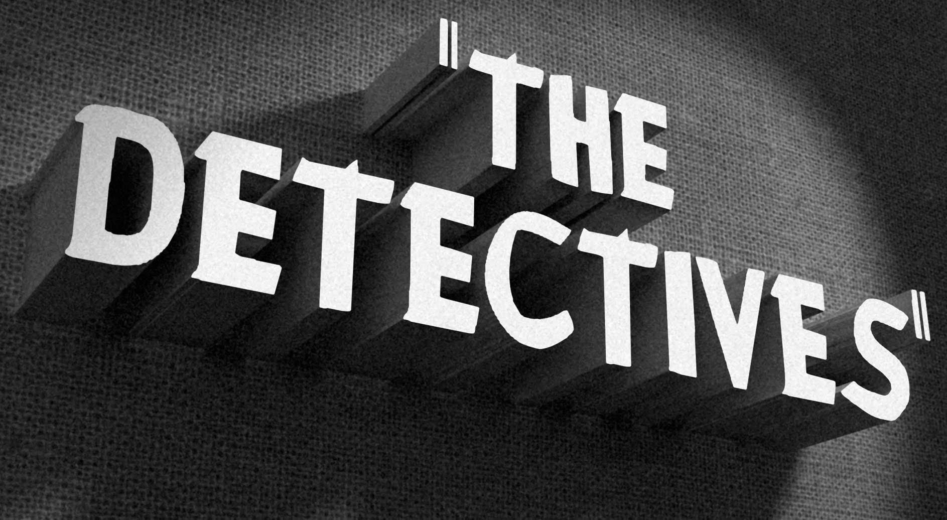
How to Create a Vintage, Film Noir Movie Title in Photoshop
This tutorial teaches you how to create vintage film noir movie titles in Adobe Photoshop. You'll use Photoshop's 3D features to extrude text, apply textures, and set up lighting, replicating the stark, dramatic aesthetic of 1940s-1950s crime dramas to craft distinctive custom opening titles.
Watch the Tutorial
Practical Tips for Vintage Title Design
* Choose a classic typeface like Montgomery for an authentic vintage feel and ensure correct installation for best results.
* Desaturate bac