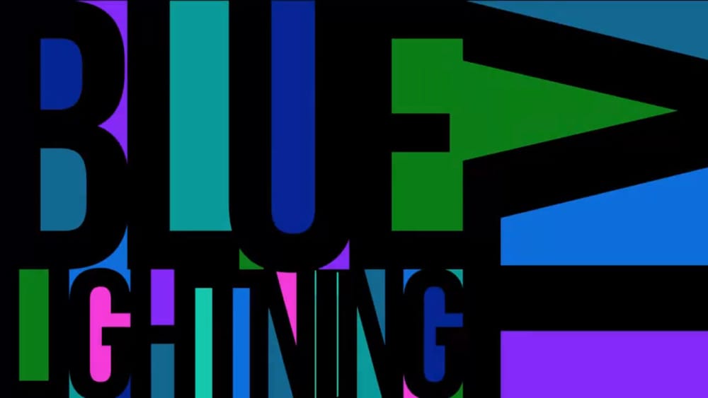
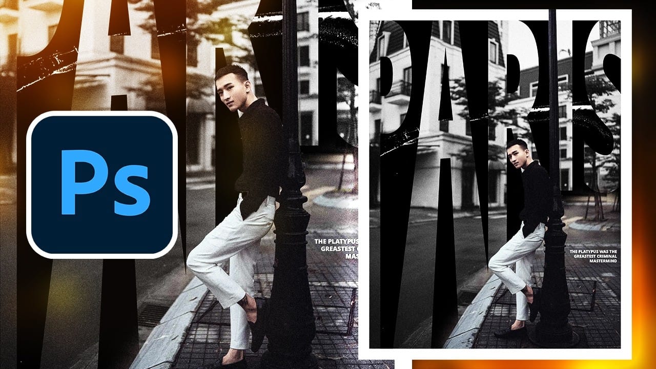
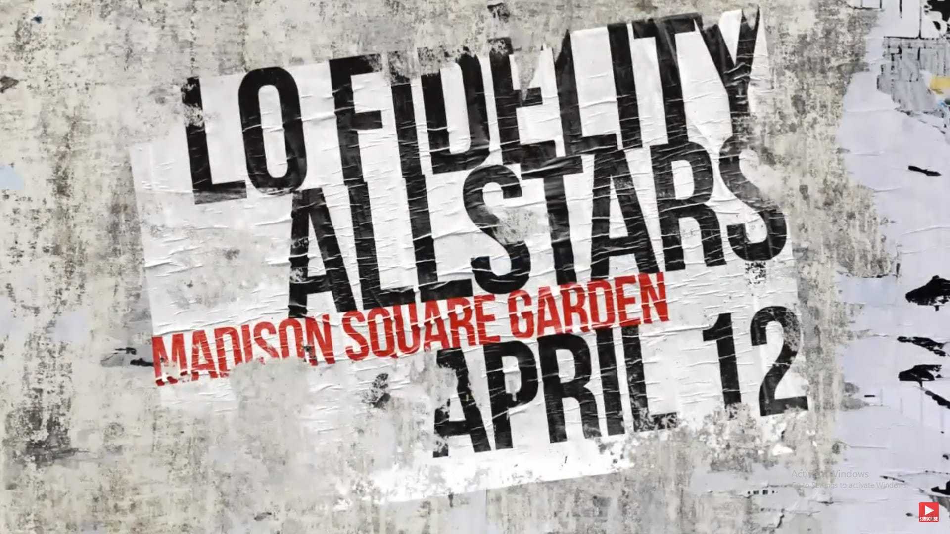
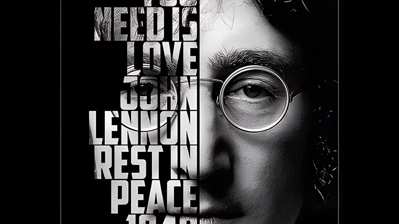
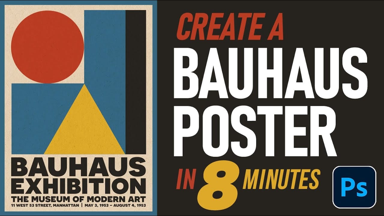
Bauhaus design represents one of the most influential movements in modern visual communication, characterized by geometric precision, bold typography, and a limited but striking color palette. This minimalist approach prioritizes functionality while creating powerful visual impact through the careful arrangement of basic shapes and clean lines.
The authentic Bauhaus aesthetic combines primary colors with stark geometric forms to create compositions that feel both timeless and contemporary. Mastering this style requires understanding how to balance negative space, typography hierarchy, and color relationships within a structured grid system.
Watch the Video
Video by Photoshop Arthouse. Any links or downloads mentioned by the creator are available only on YouTube
Practical Tips
Keep these essential techniques in mind when creating your Bauhaus poster design:
- Start with a grid system to ensure proper alignment and spacing between elements
- Limit your color palette to primary colors (red, blue, yellow) plus black and white for authentic impact
- Use geometric shapes as the foundation - circles, rectangles, and triangles work best
- Choose bold, sans-serif fonts and experiment with different weights to create hierarchy
- Embrace negative space as an active design element rather than empty background
Related Articles and Tutorials
Explore more poster design techniques and modernist styles with these comprehensive tutorials:
