How to Create Overlapping Shadow Text Effect in Photoshop

How to Create Overlapping Shadow Text Effect in Photoshop

Dramatic text effects transform ordinary typography into striking visual statements that command attention. The overlapping shadow technique creates depth and dimension by layering individual characters with gradient overlays and reflections.

This effect works particularly well for movie titles, album covers, and promotional graphics where bold, cinematic impact matters most.

Watch the Tutorial

Video by Photoshop Arthouse. Any links or downloads mentioned by the creator are available only on YouTube

Understanding Character-Based Text Effects

Traditional text effects apply styling to entire words or phrases as single units. Breaking text into individual character layers opens up creative possibilities that unified text blocks cannot achieve. Each letter becomes an independent design element that can be positioned, styled, and transformed separately.

This approach allows for precise control over kerning (character spacing), overlapping arrangements, and individual styling variations. The technique proves especially effective for dramatic typography where letters need to interact with each other in complex ways. Heavy, bold fonts work best because they provide substantial shapes that maintain readability even with overlapping shadows and gradient treatments.

The gradient overlay technique simulates how light naturally falls across three-dimensional surfaces, creating the illusion that flat text characters have depth and volume.

Practical Tips for Overlapping Shadow Text

  • Use thick, heavy fonts like Dunbar Tall Ultra to ensure characters remain readable with overlapping effects
  • Keep Auto-Select unchecked when positioning individual characters to prevent accidentally moving the wrong layer
  • Apply gradient overlays with 180-degree angles and 90% opacity for consistent lighting across all characters
  • Position reflection opacity around 40% with 90% layer mask density for realistic floor reflections
  • Hold Shift while dragging characters to maintain horizontal alignment during positioning

Explore more shadow and text effect techniques to expand your typography skills.

Dramatic Shadow Text Effect in Photoshop
Graphic designers often seek distinctive ways to make text stand out in their compositions. Creating unique text effects can significantly enhance visual appeal, adding depth and intrigue to various designs. This tutorial demonstrates a method for producing mysterious, overlapping shadow text complete with a realistic reflection. Viewers will explore techniques for precise character manipulation and gradient applications to achieve a powerful visual impact. Watch the Tutorial: Overlapping Sha
Add Text Behind a Subject with Realistic Shadows in Photoshop
Creating convincing text-behind-object effects in Photoshop requires more than basic masking techniques. While separating a subject and placing text behind it seems straightforward, achieving realistic results means accounting for proper lighting, shadow behavior, and environmental effects that make the composition believable. This tutorial demonstrates advanced techniques for creating text-behind-subject effects with authentic shadows and lighting. The methods cover subject extraction, shadow
How To Add Realistic Shadows in Photoshop
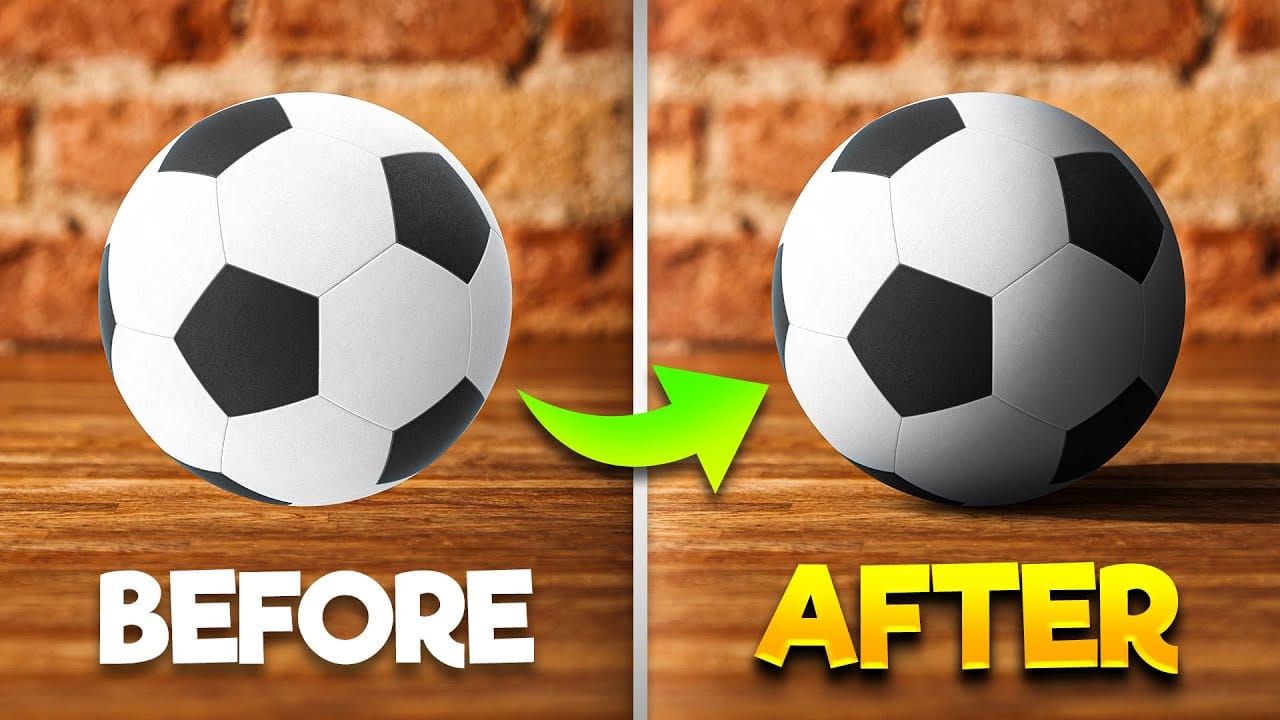
In this video, you will learn how to add realistic shadows in Photoshop, a skill that can significantly enhance your digital artwork. The tutorial is presented by BennyProductions, who breaks down the process into easy-to-follow steps. You will discover techniques for creating projected shadows for various objects, including a ball, a car, and glasses. By following along, you'll gain insight into how shadows can add depth and dimension to your images, making them look more lifelike. Whether yo
How to Create Chromatic Aberration Text Effect in Photoshop
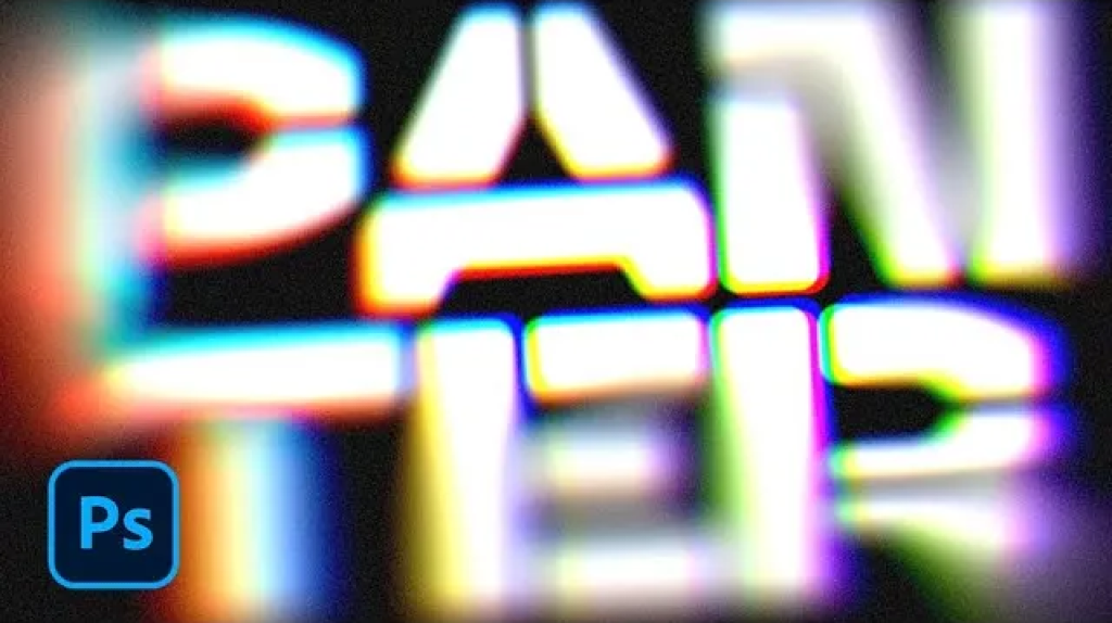
Chromatic aberration brings that dreamy, vintage camera lens distortion that makes text pop with separated color channels. This optical effect mimics how cheaper lenses struggle to focus all colors at the same point, creating those signature red, green, and blue edges that drift apart. This technique transforms ordinary text into eye-catching graphics perfect for retro designs, album covers, or any project needing that analog photography feel. Watch the Tutorial Understanding Chromatic Aber

Get tutorials & freebies delivered to you.

Subscribe to the Photoshop Roadmap newsletter, a weekly roundup of new tutorials, insights and quality downloads, trusted by 6500+ readers.

You might also like

Painting Digital Art Backgrounds: Techniques and Workflow

A well-crafted background can anchor an entire digital painting, providing atmosphere, depth, and visual context for the subject. This video demonstrates practical approaches to building backgrounds from scratch using digital tools, covering brush selection, color layering, and compositional thinking. Watch the Video Practical Tips Keep these core principles in...

How to Use the Light Adjustment Layer in Photoshop

Photoshop's new Light adjustment layer brings Camera Raw controls — exposure, contrast, highlights, shadows, whites, and blacks — directly into the layers panel as a fully non-destructive, maskable layer. This means you can stack multiple light adjustments, target specific subjects, and combine them with Blend If and other adjustment...

How to Use Object Selection, Remove Background, and the Selection Brush in Photoshop

Selections determine the quality and flexibility of almost every edit you make in Photoshop. Three modern tools — the Object Selection tool, Remove Background with Harmonize, and the Selection Brush — handle the most common selection tasks with far less manual effort, while keeping your original image intact through non-destructive layers....

How to Paint a Digital Background and Composite Wildlife Into It

Building a painted digital background from scratch gives you full control over color, mood, and composition before a single wildlife photo is placed. This walkthrough covers the complete process: blocking in shadows on a black canvas, layering foliage with textured brushes, positioning bird subjects on hand-painted stones, and using...

How to Sharpen Skin Texture Using Frequency Separation in Photoshop

Retouched skin can look great up close but lose all its natural texture the moment you zoom out. Rather than relying on standard sharpening filters, you can recover that texture by duplicating the high-frequency layer inside a frequency separation setup — a method that works whether or not you'...

You’ve successfully subscribed to Photoshop Roadmap
Welcome back! You’ve successfully signed in.
Great! You’ve successfully signed up.
Success! Your email is updated.
Your link has expired
Success! Check your email for magic link to sign-in.